BlackMan Brewing
Creative Direction • Branding • Packaging
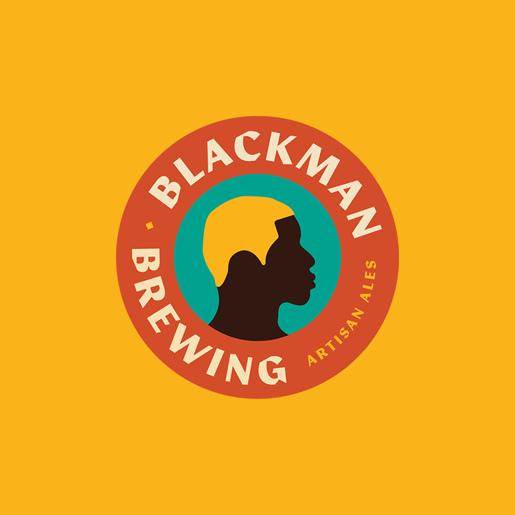
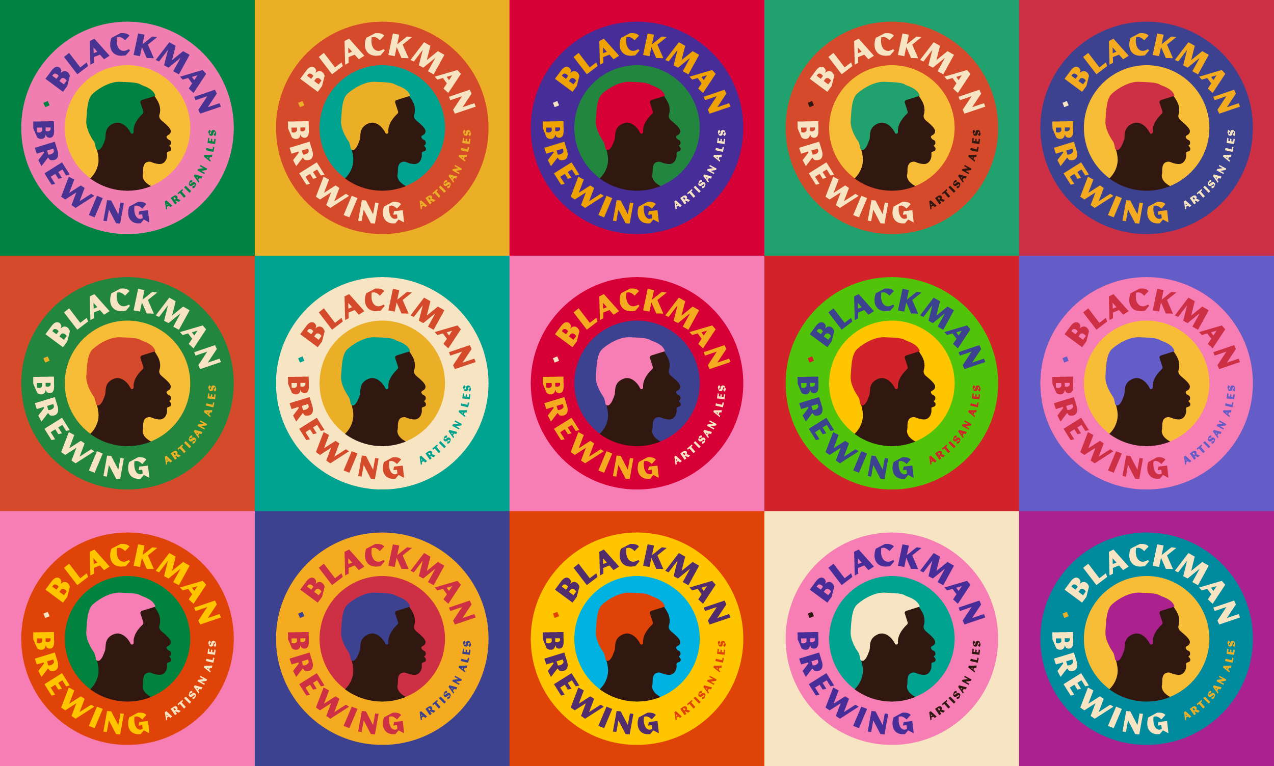
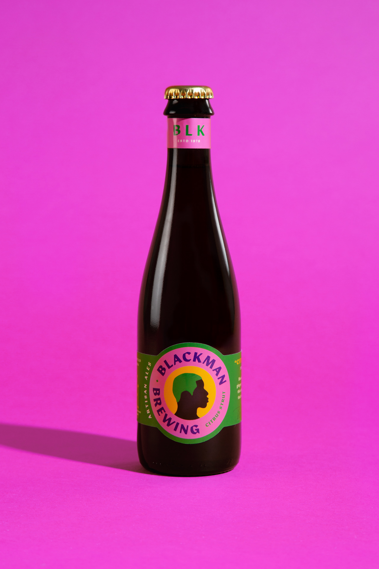
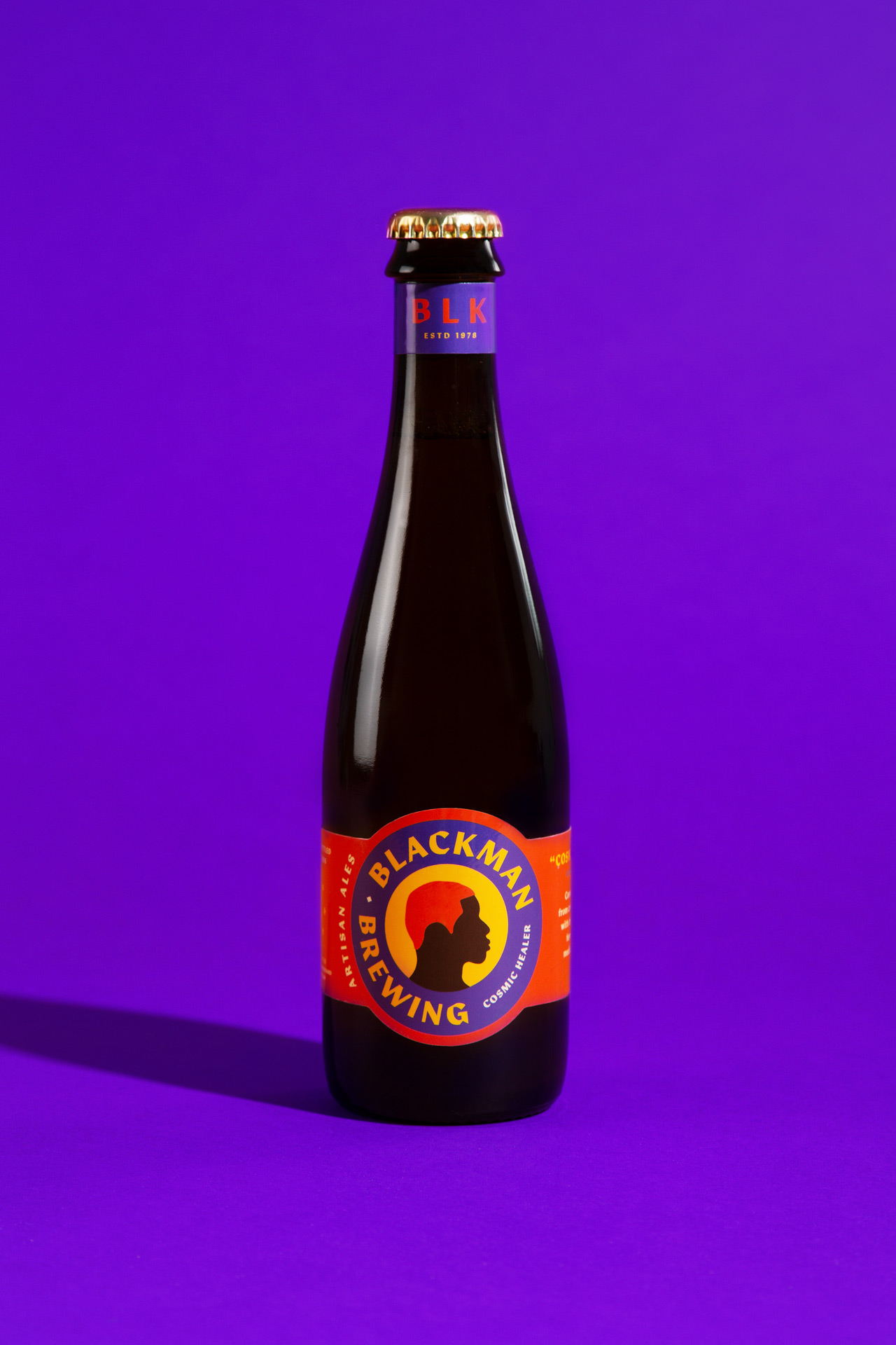
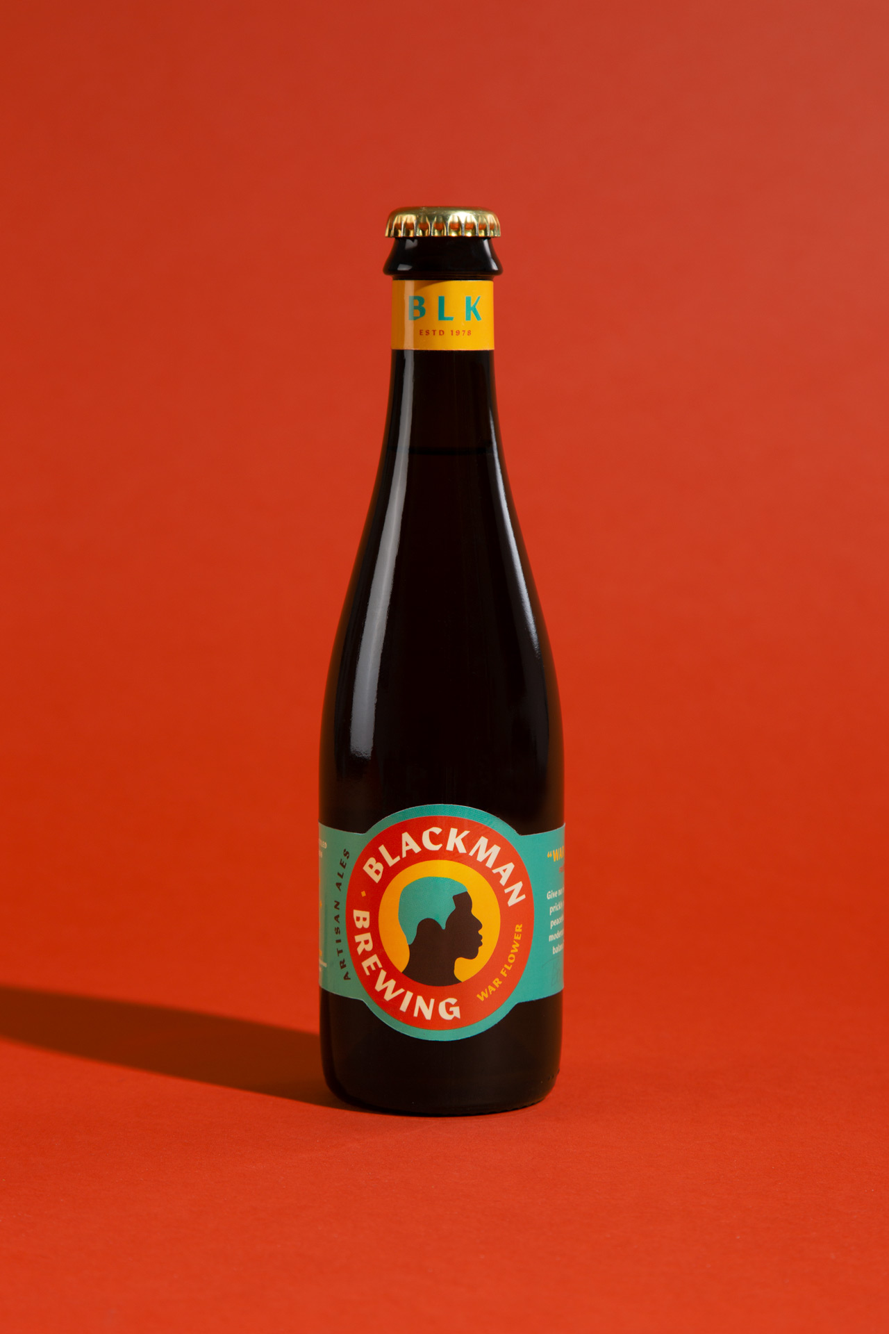
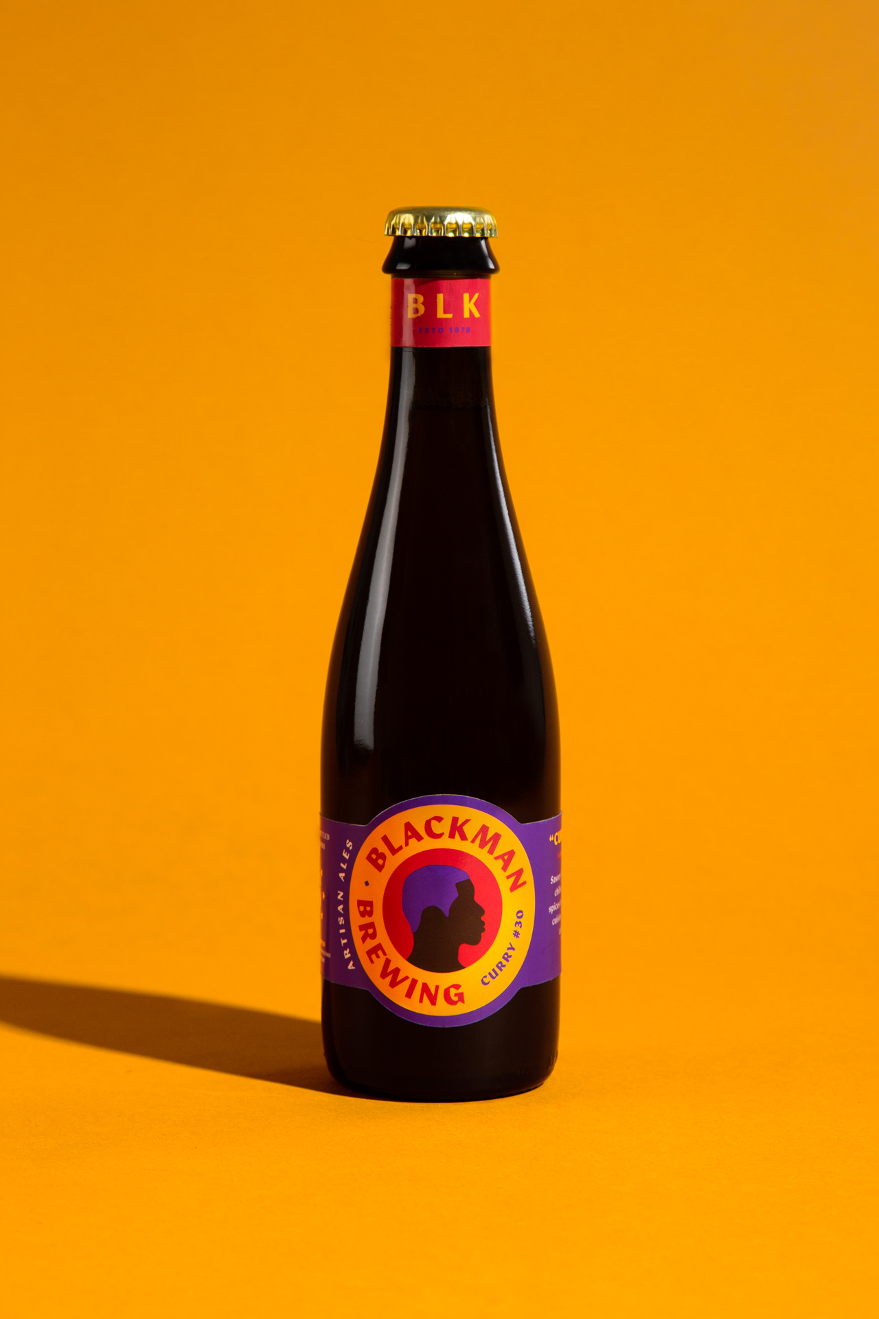
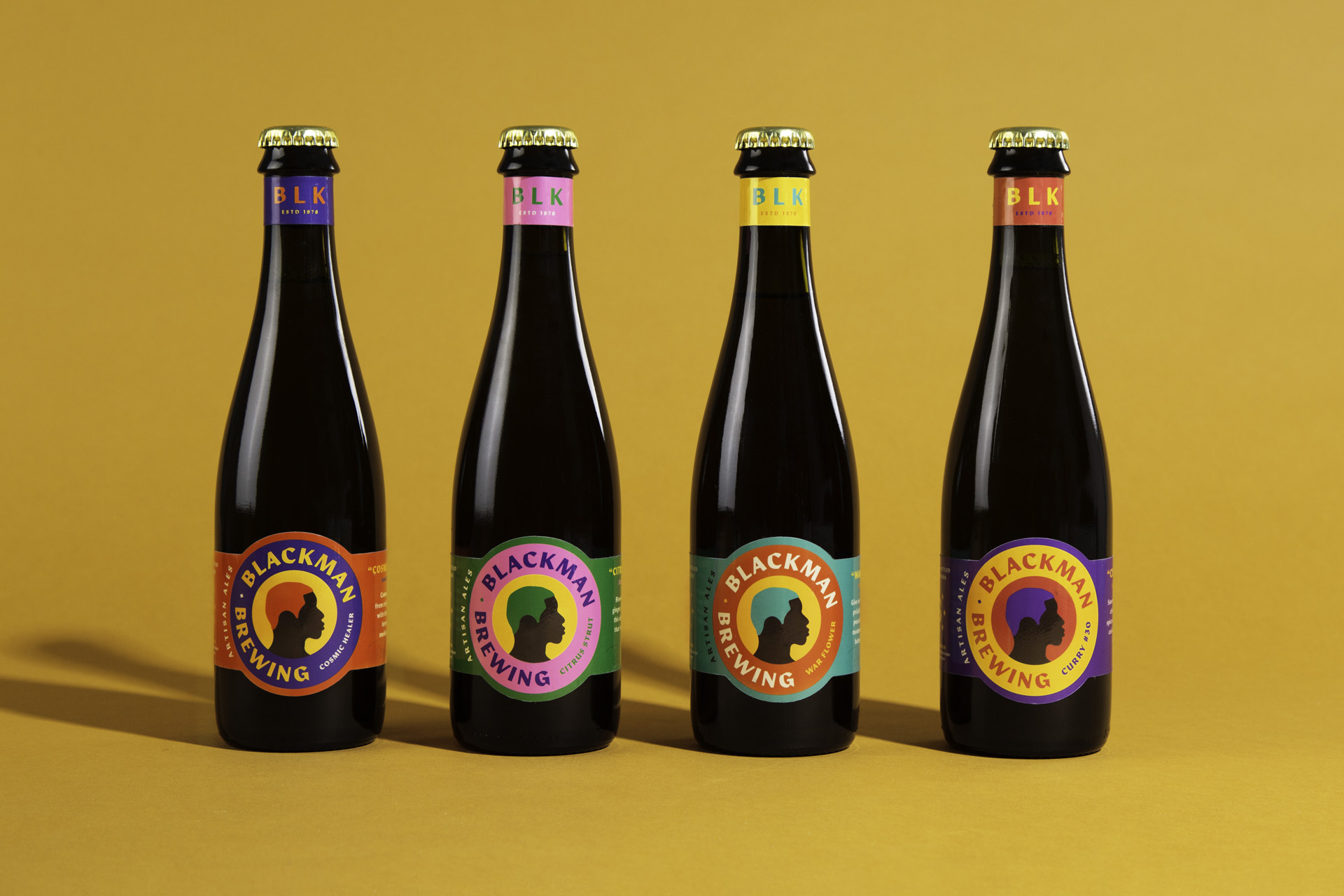
After leaving a full-time position at a commercial brewery, Barrett Tillman focused on growing his homebrew brand of sour and experimental beer with a fresh look. We took the elements of his original labels and designed a colorful system around a bold silhouette.
While a traditional craft brewery may need only a handful of new labels per year, a small operation like Barrett's is only limited by his own creativity. The brand's boldness and simplicity allow for quick iteration through color and text changes giving him more time and energy for the experimentation.

BARRETT TILLMAN, FOUNDER & BREWER AT BLACKMAN BREWING
More Projects
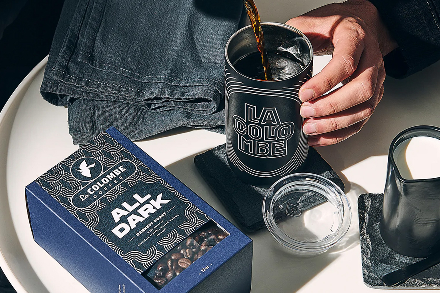
La Colombe Coffee Roast PackagingBranding and Packaging
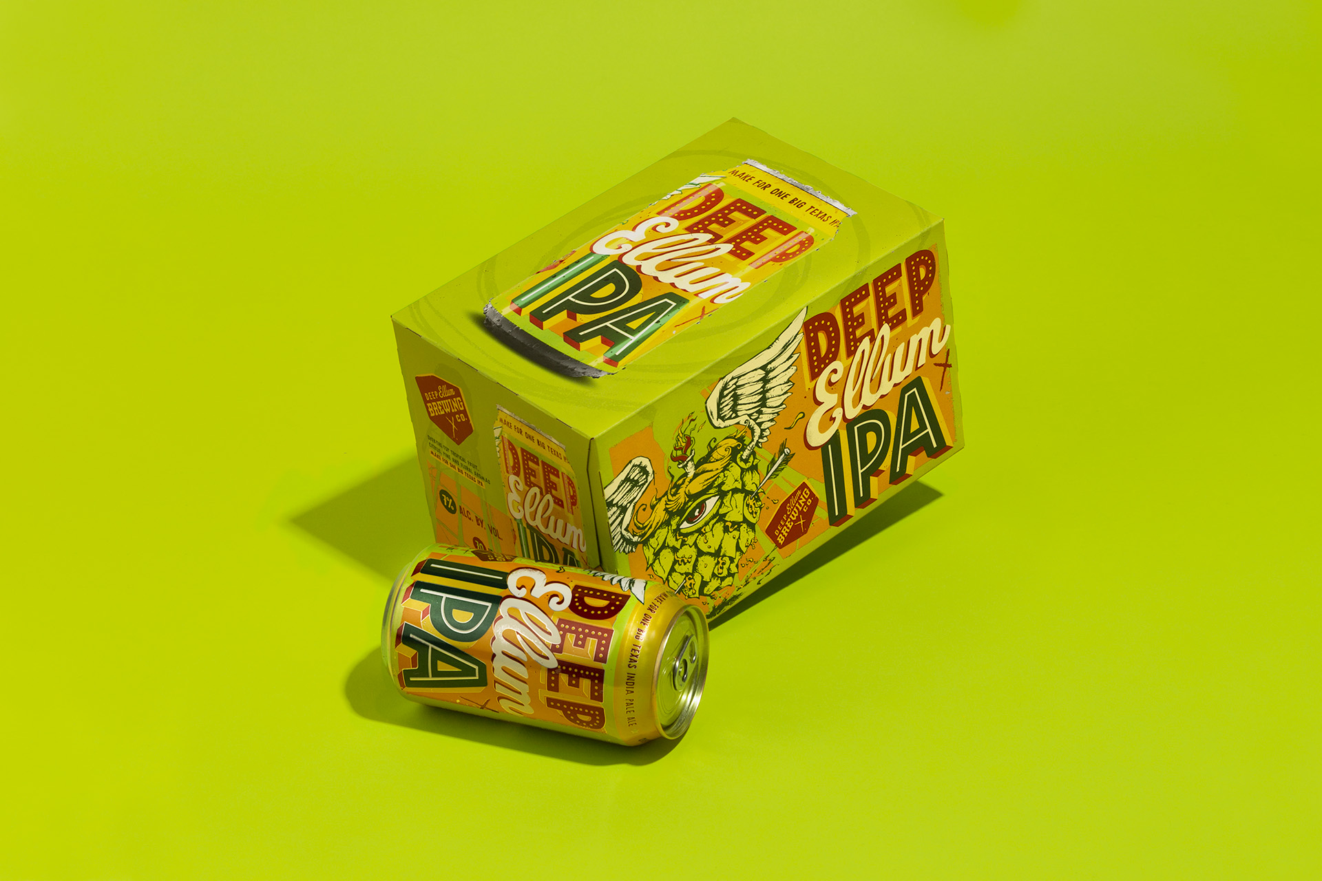
Deep Ellum IPA Brand RefreshBreathing new life to an iconic IPA brand without losing its recognition on the shelf.
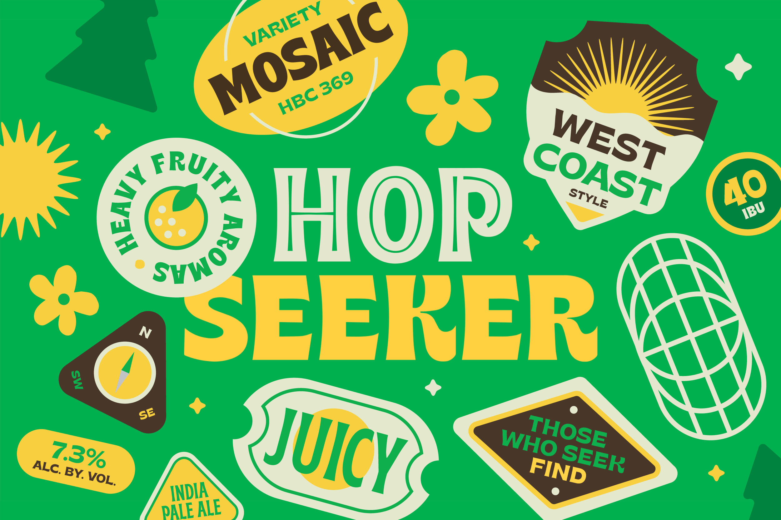
Hop Seeker IPA SeriesA fun and versatile world of characters and stickers for a rotating India Pale Ale series.
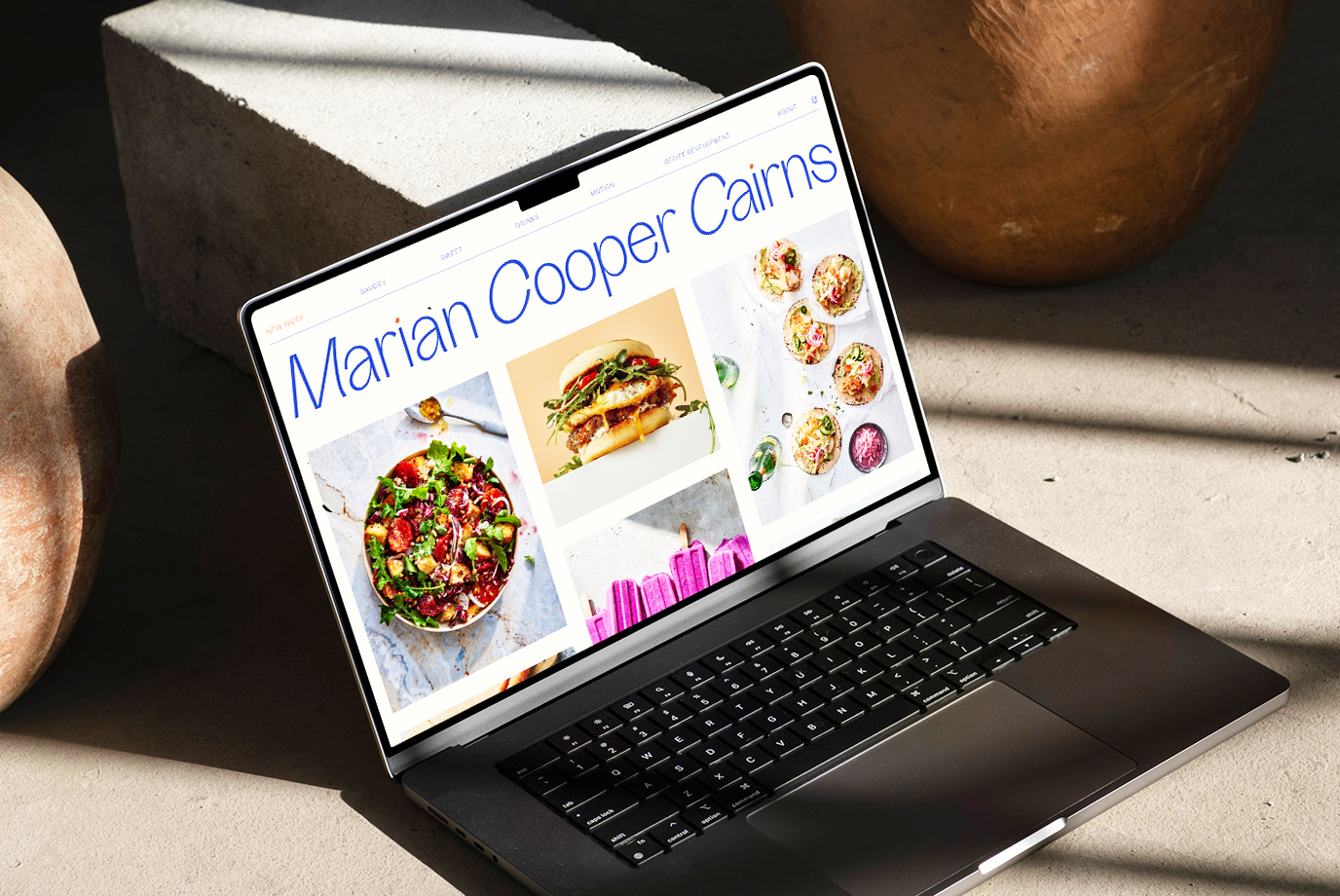
Marian Cooper Cairns • Logo and Website RefreshProject type
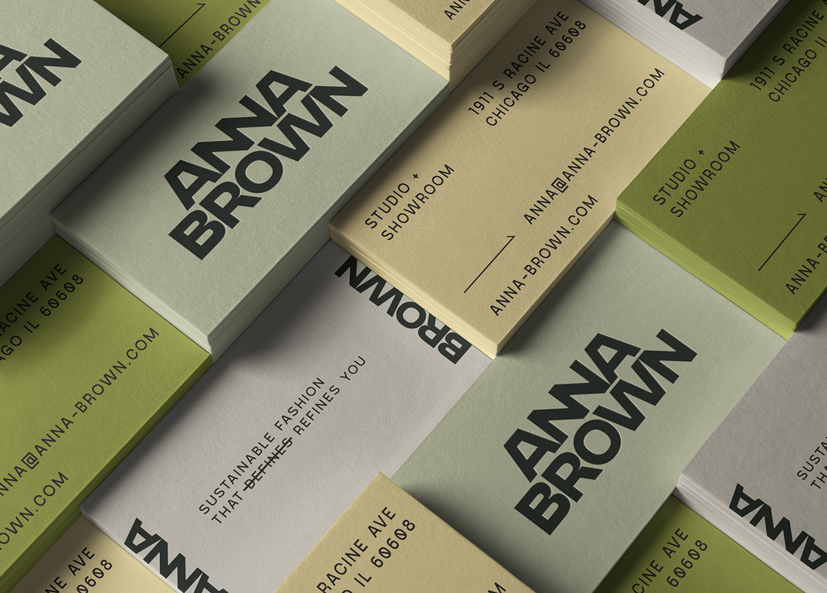
Anna Brown StudioProject type
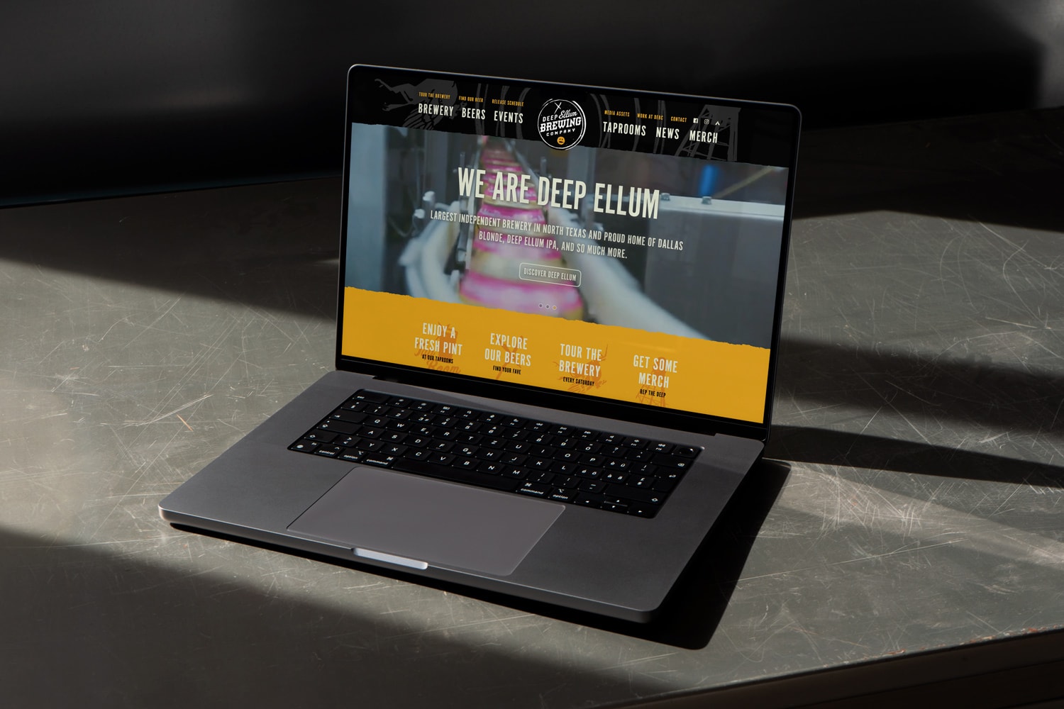
Deep Ellum Brewing Website RedesignProject type
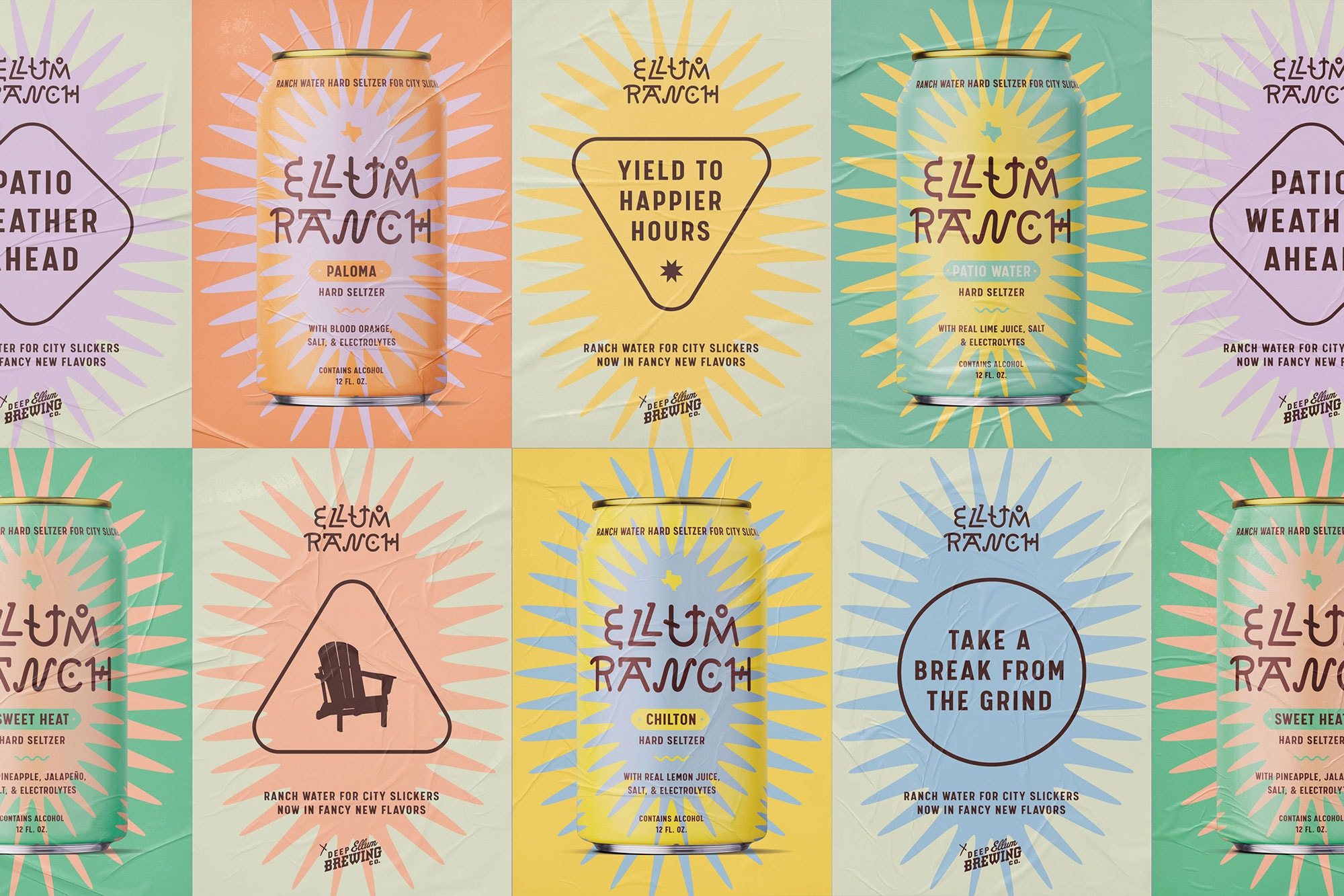
Ellum Ranch Patio WaterA ranch water hard seltzer that's proud of its city slicker roots.
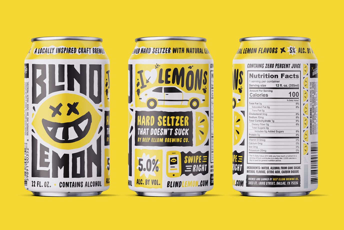
Blind Lemon Hard Seltzer NewProject type

Common DeskProject type
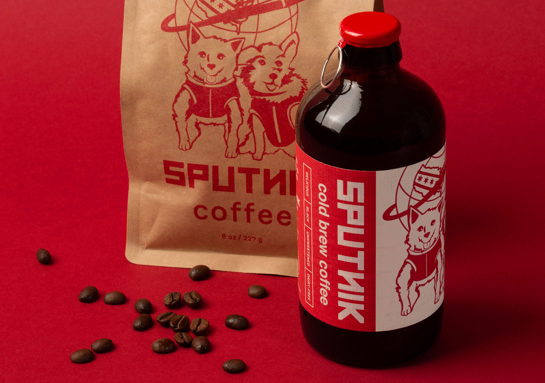
Sputnik Cold Brew CoffeeSputnik Cold Brew Bottle Label
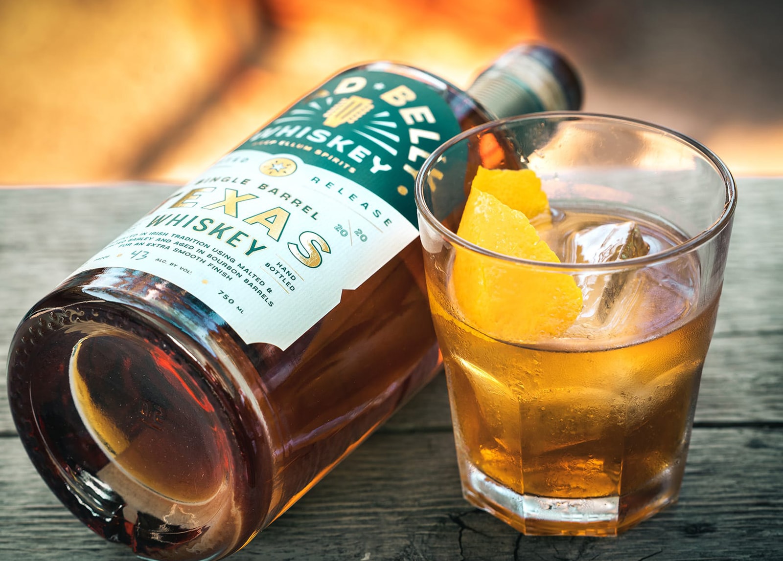
Lead Belly WhiskeyProject type
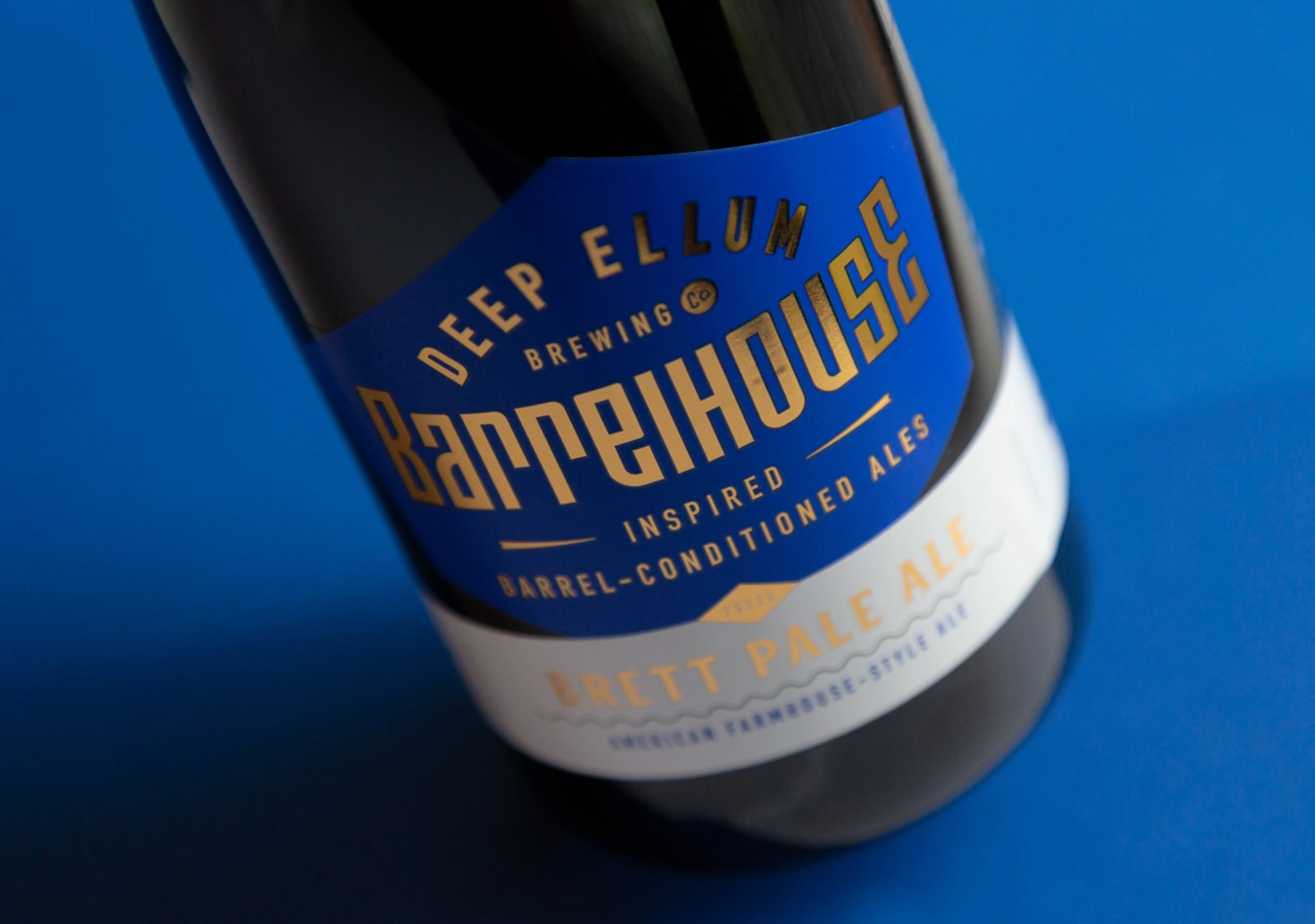
Deep Ellum BarrelhouseBranding & Packaging

