Sputnik Coffee
Cold Brew
Creative Direction • Packaging • Photography
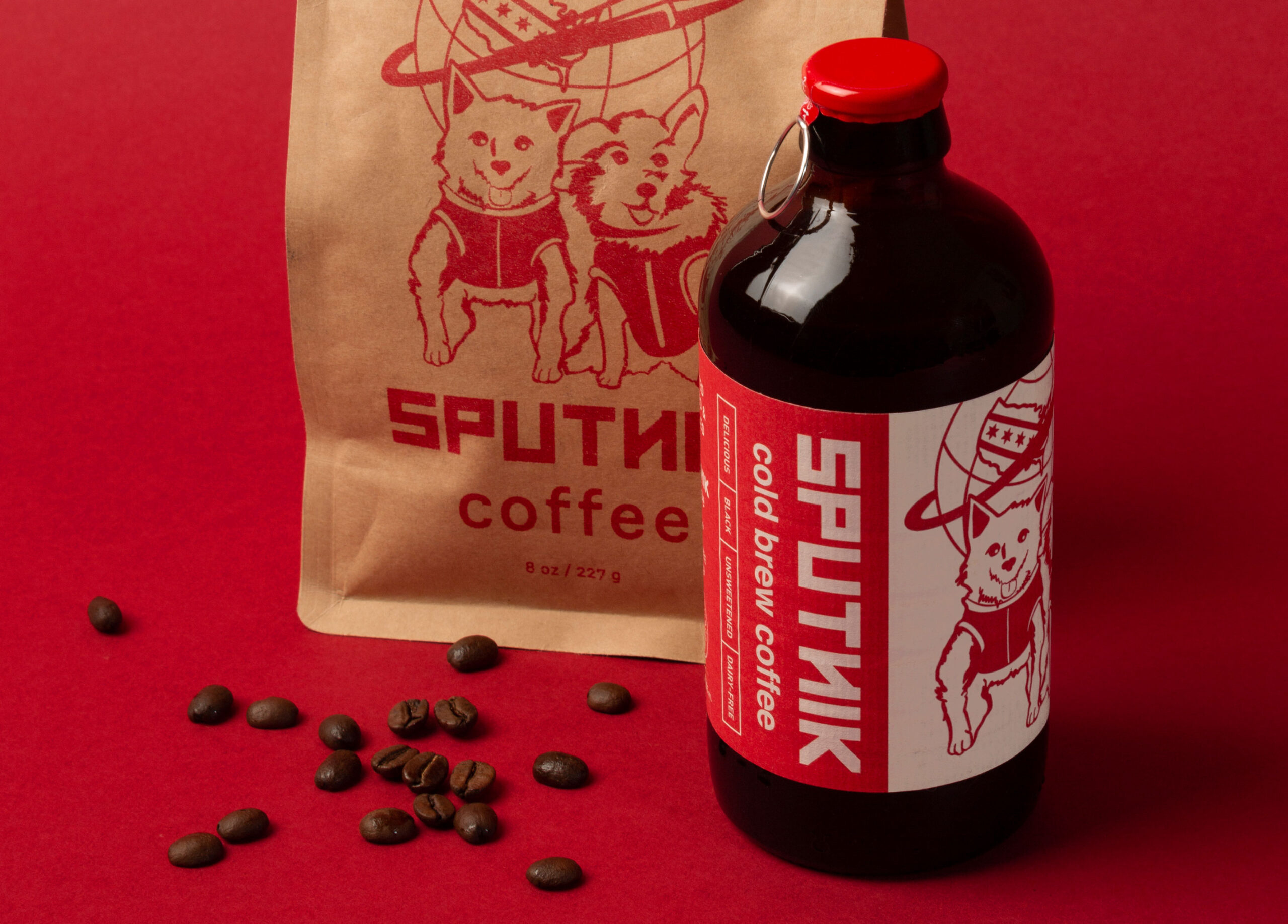
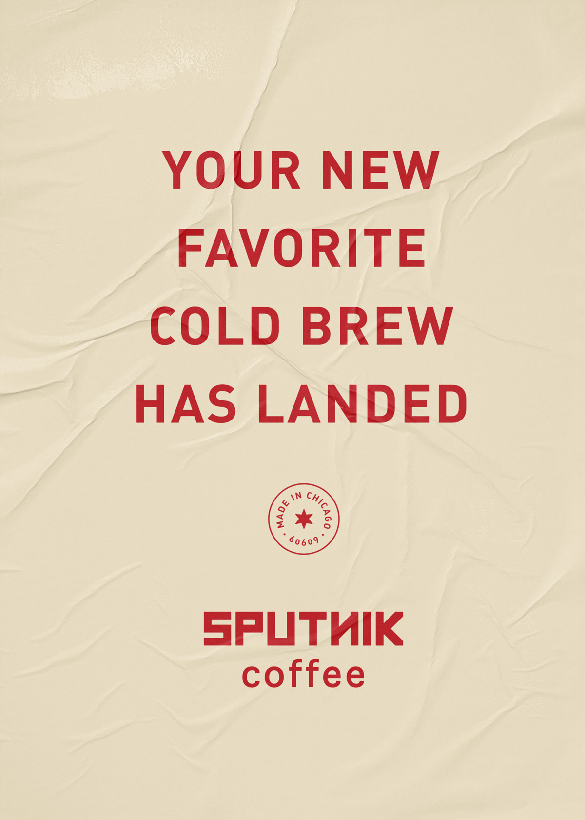
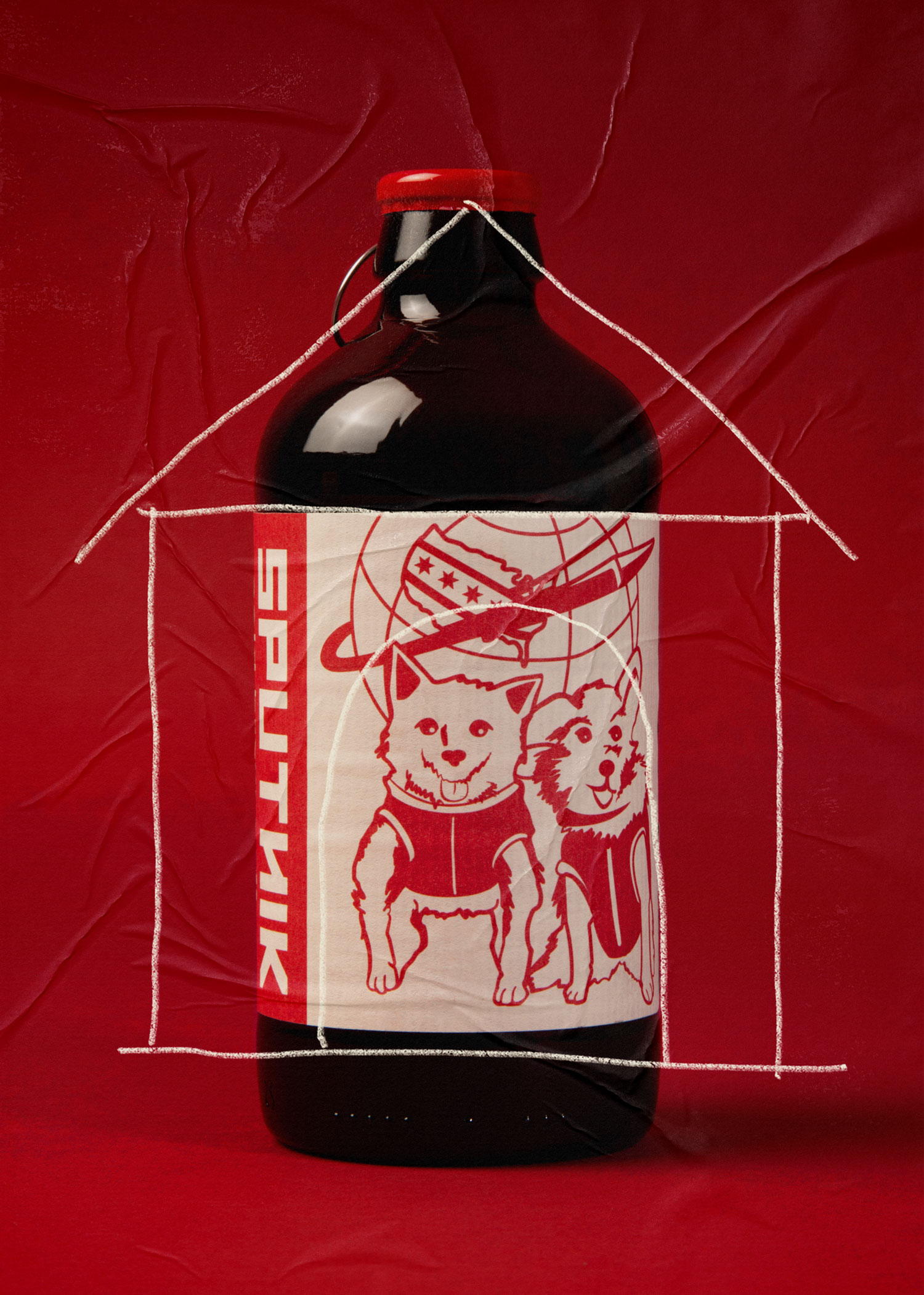
The brand's cute and quirky space dog illustration differentiates the coffee on the shelf and has become a key piece of the brand's story – it has also gained quite a loyal following in the Chicago area. We made sure that the pups have a dominant presence on the cold brew label while building a new type-driven architecture around the logo.
Since the roastery and cafe are located in a predominantly Spanish-speaking neighborhood, we included both English and Spanish languages on the label. This helps Sputnik's cold brew stand out on shelf by speaking directly to their Spanish-speaking customers throughout the midwest.
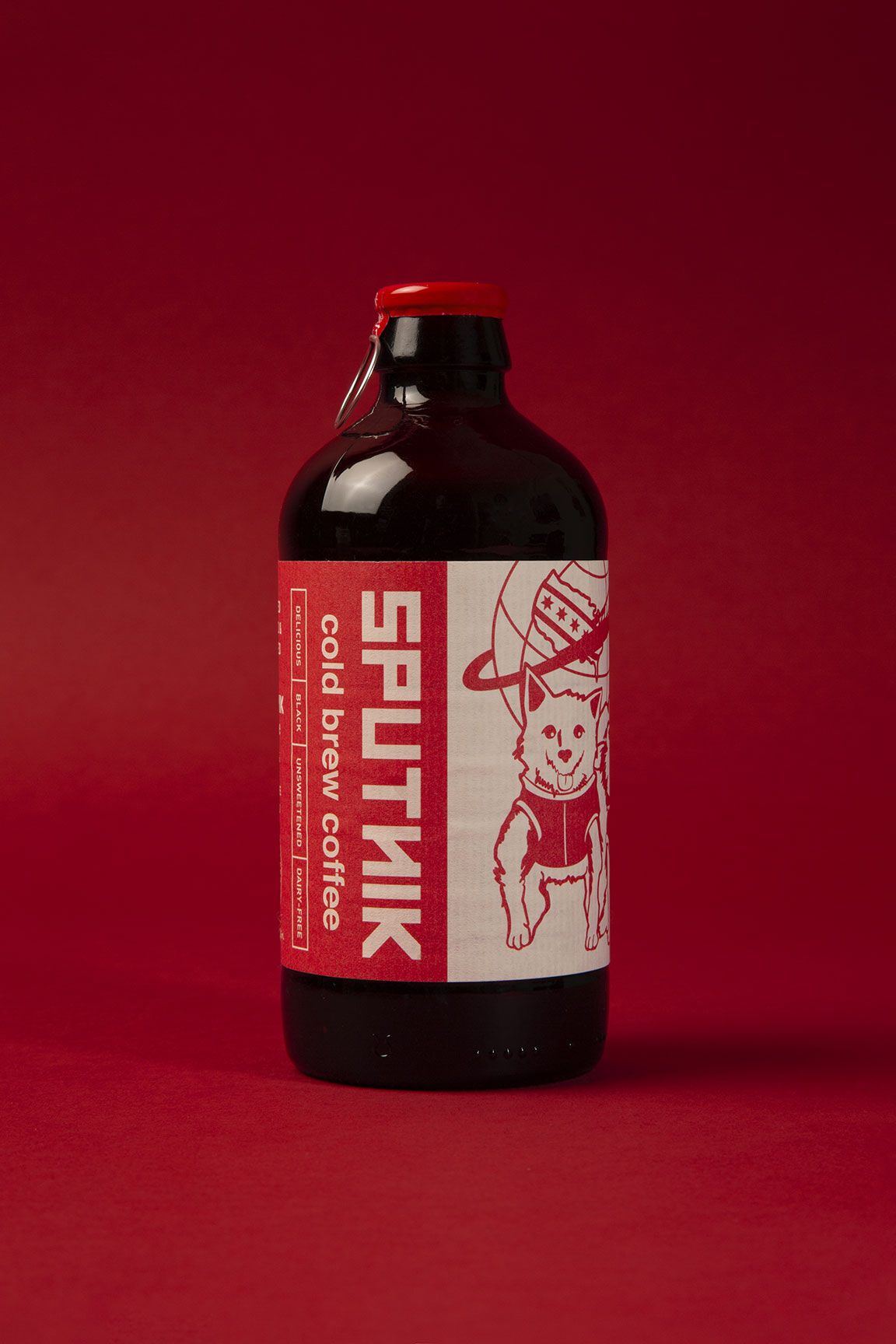
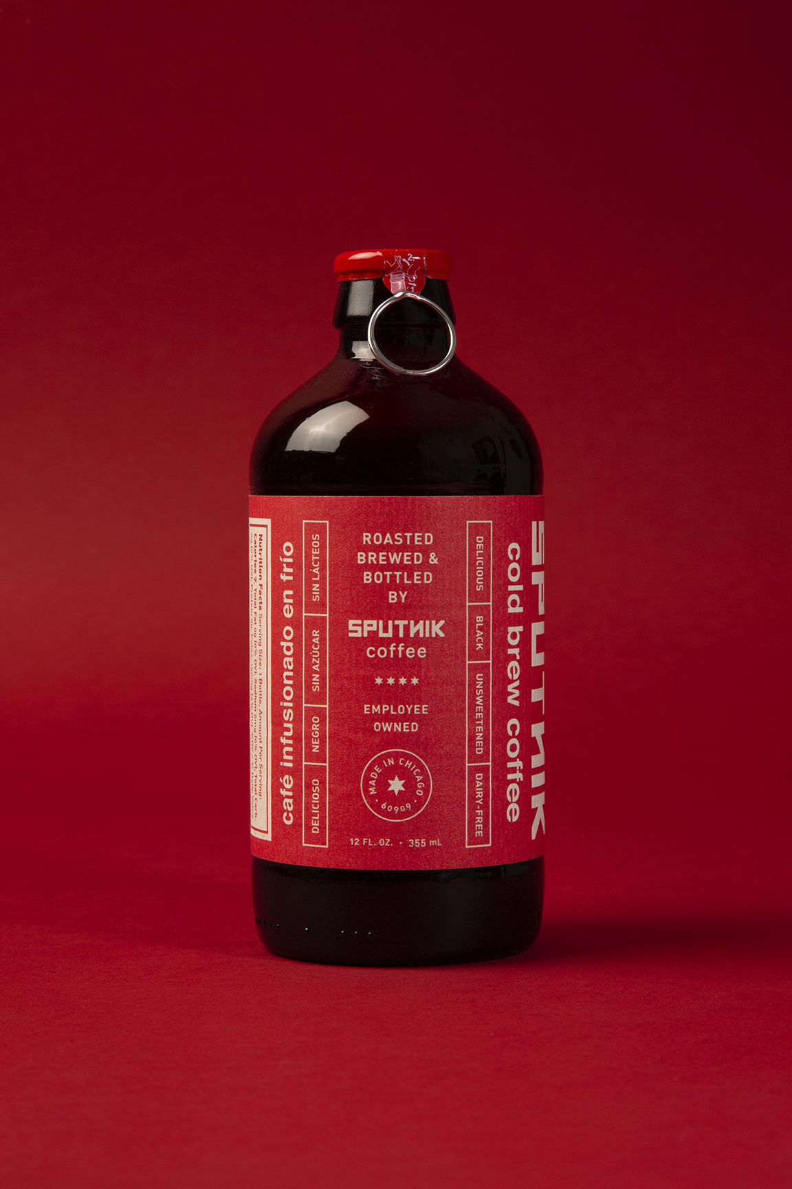
We chose old school paper labels combined with a unique pull tab cap to create a unique look that adds to the experience of opening the cold brew. The texture of paper labels feels satisfying to the touch and gives a more craft feel in an industry where many brands are going for clean and sleek.
More Projects
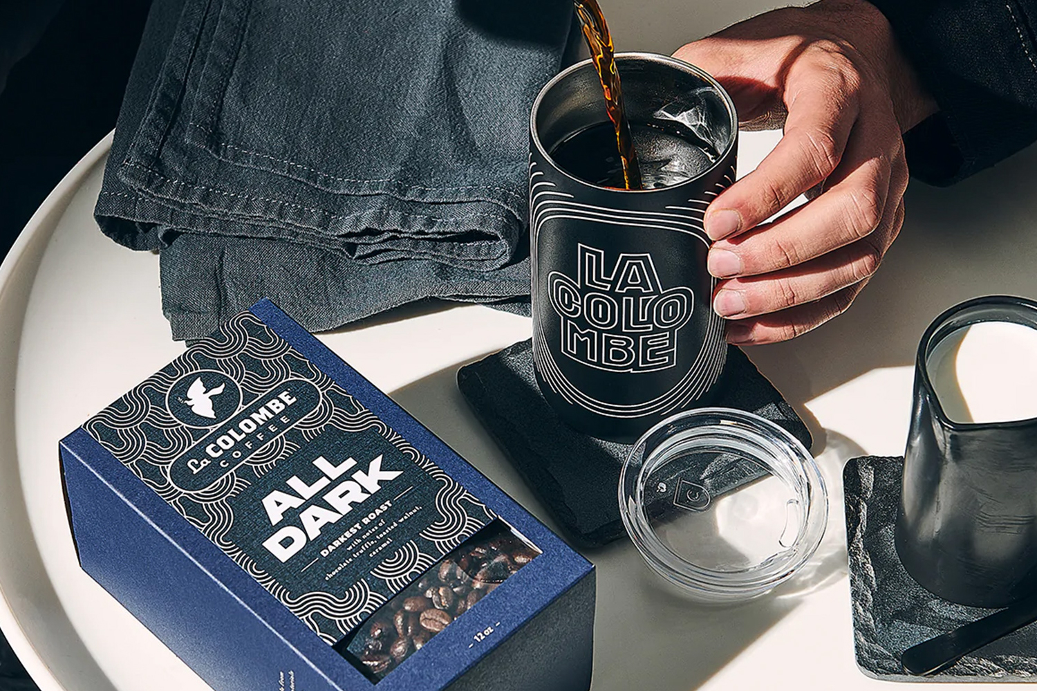
La Colombe Coffee Roast PackagingBranding and Packaging
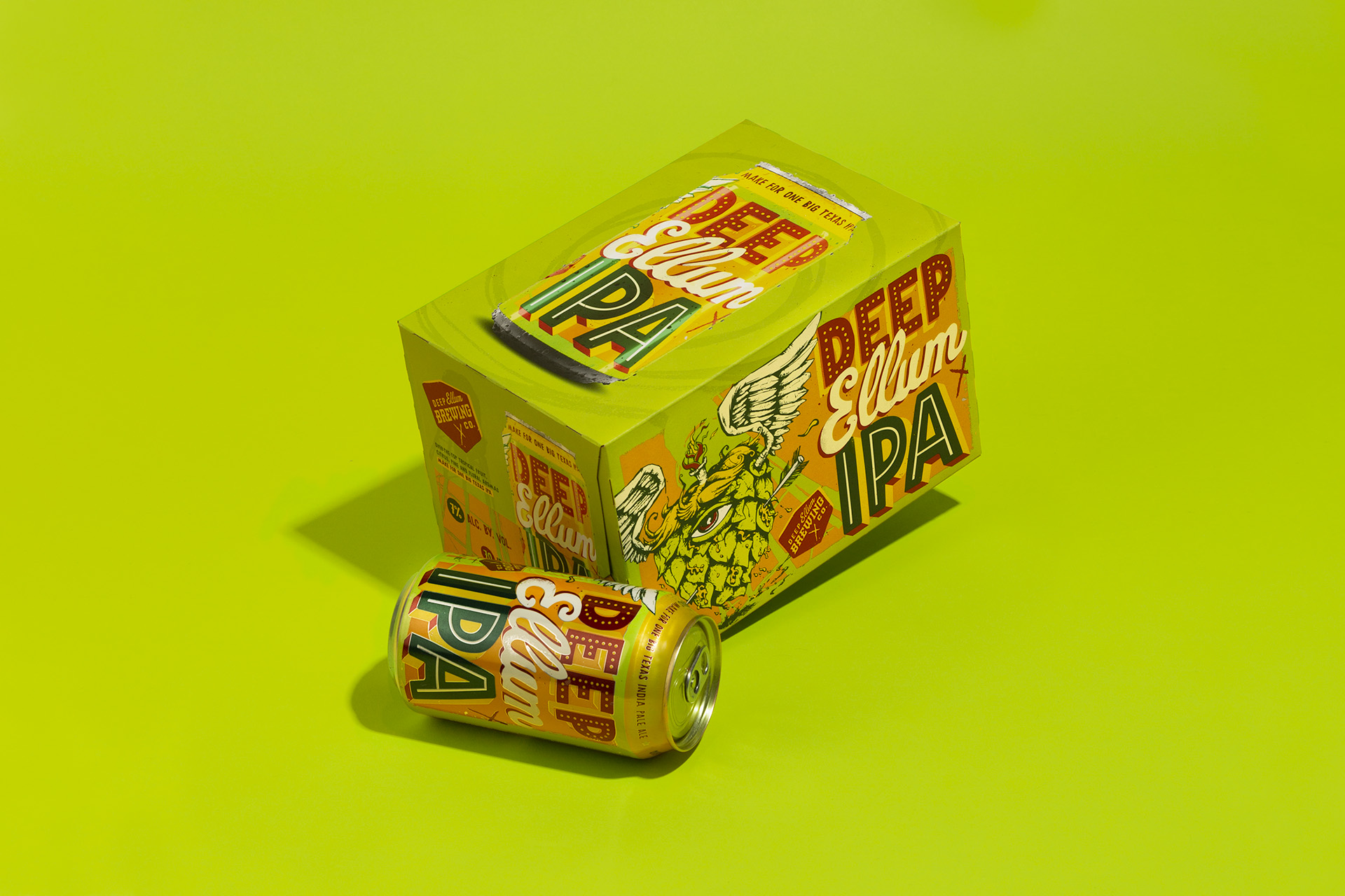
Deep Ellum IPA Brand RefreshBreathing new life to an iconic IPA brand without losing its recognition on the shelf.
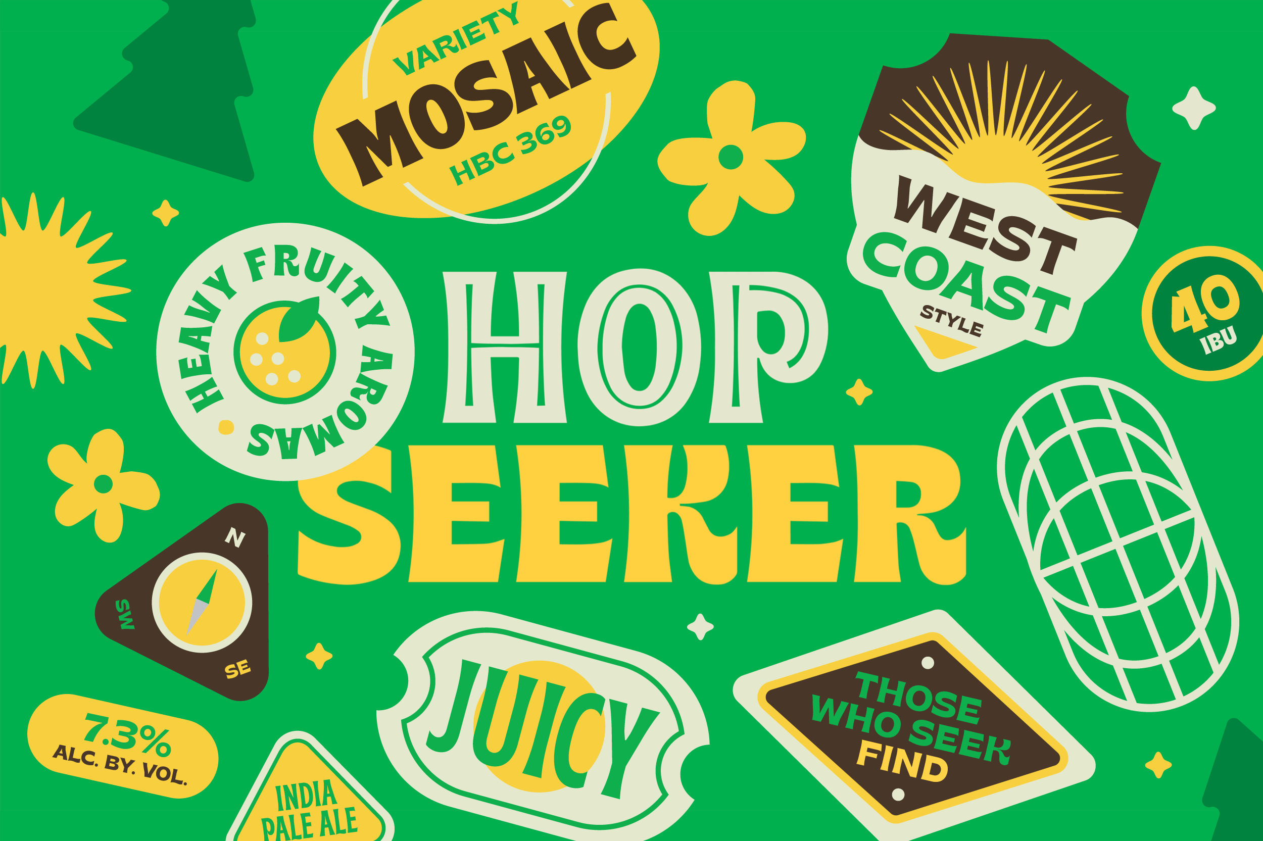
Hop Seeker IPA SeriesA fun and versatile world of characters and stickers for a rotating India Pale Ale series.
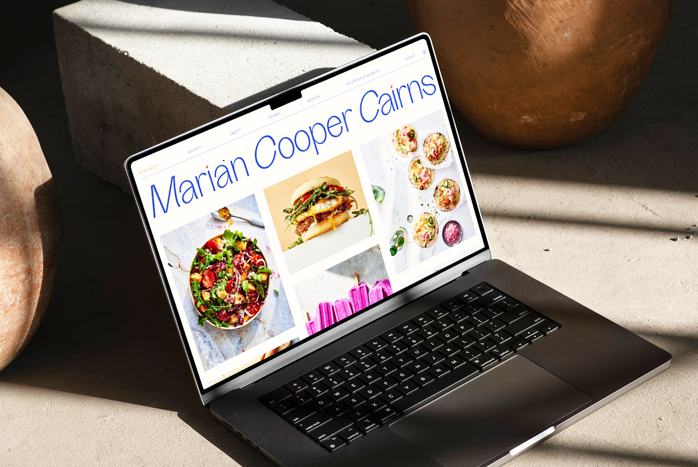
Marian Cooper Cairns • Logo and Website RefreshProject type
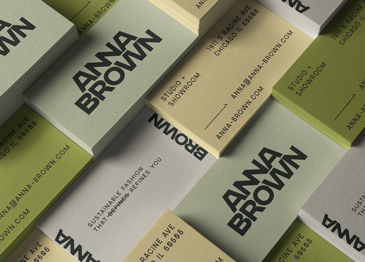
Anna Brown StudioProject type
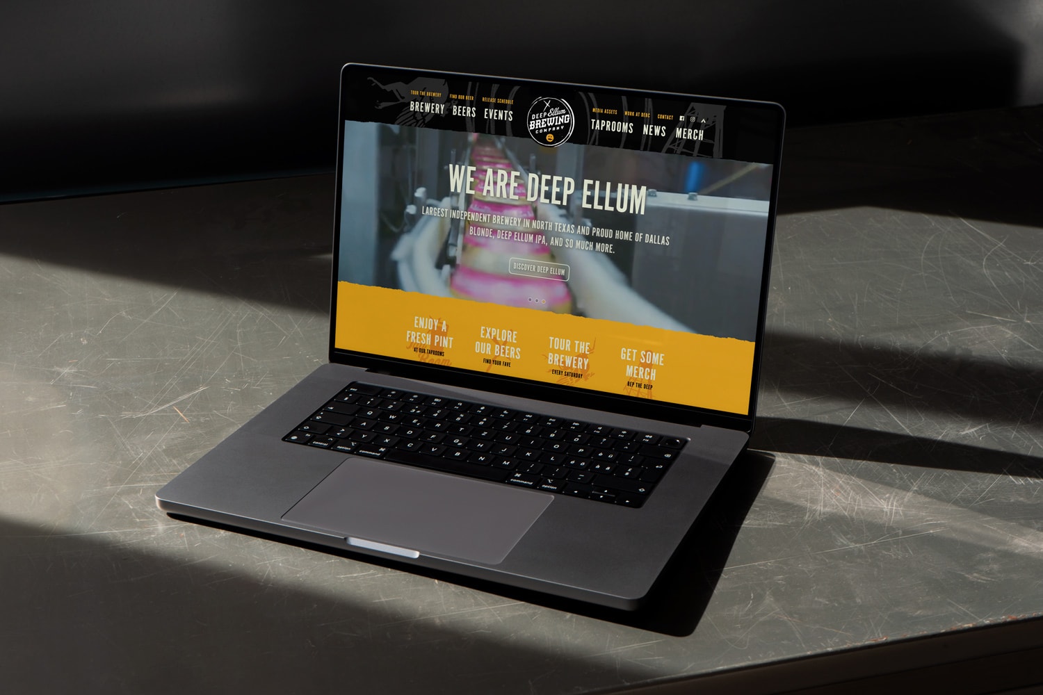
Deep Ellum Brewing Website RedesignProject type
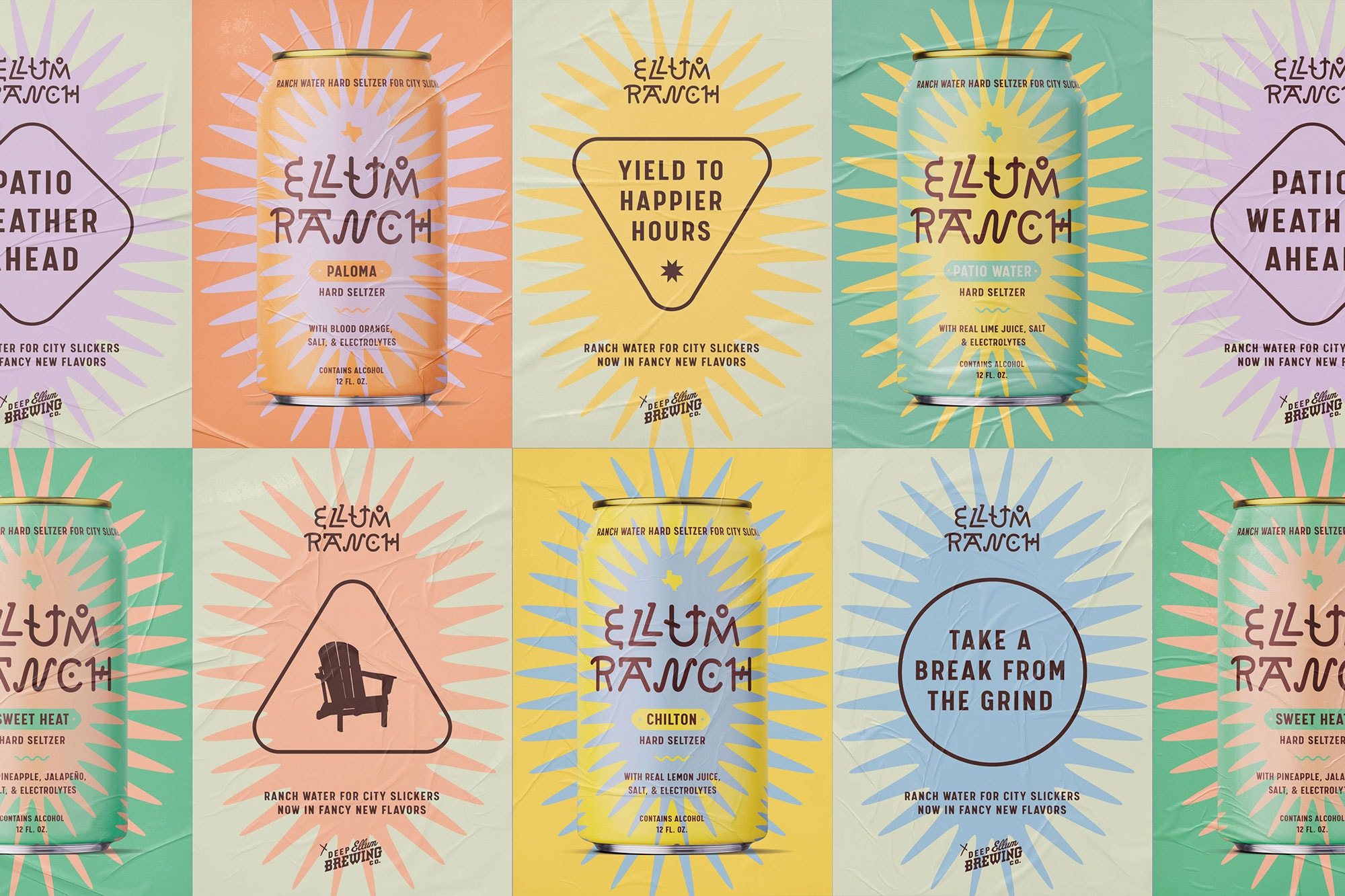
Ellum Ranch Patio WaterA ranch water hard seltzer that's proud of its city slicker roots.
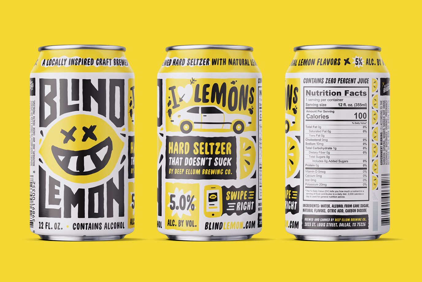
Blind Lemon Hard Seltzer NewProject type
Common DeskProject type
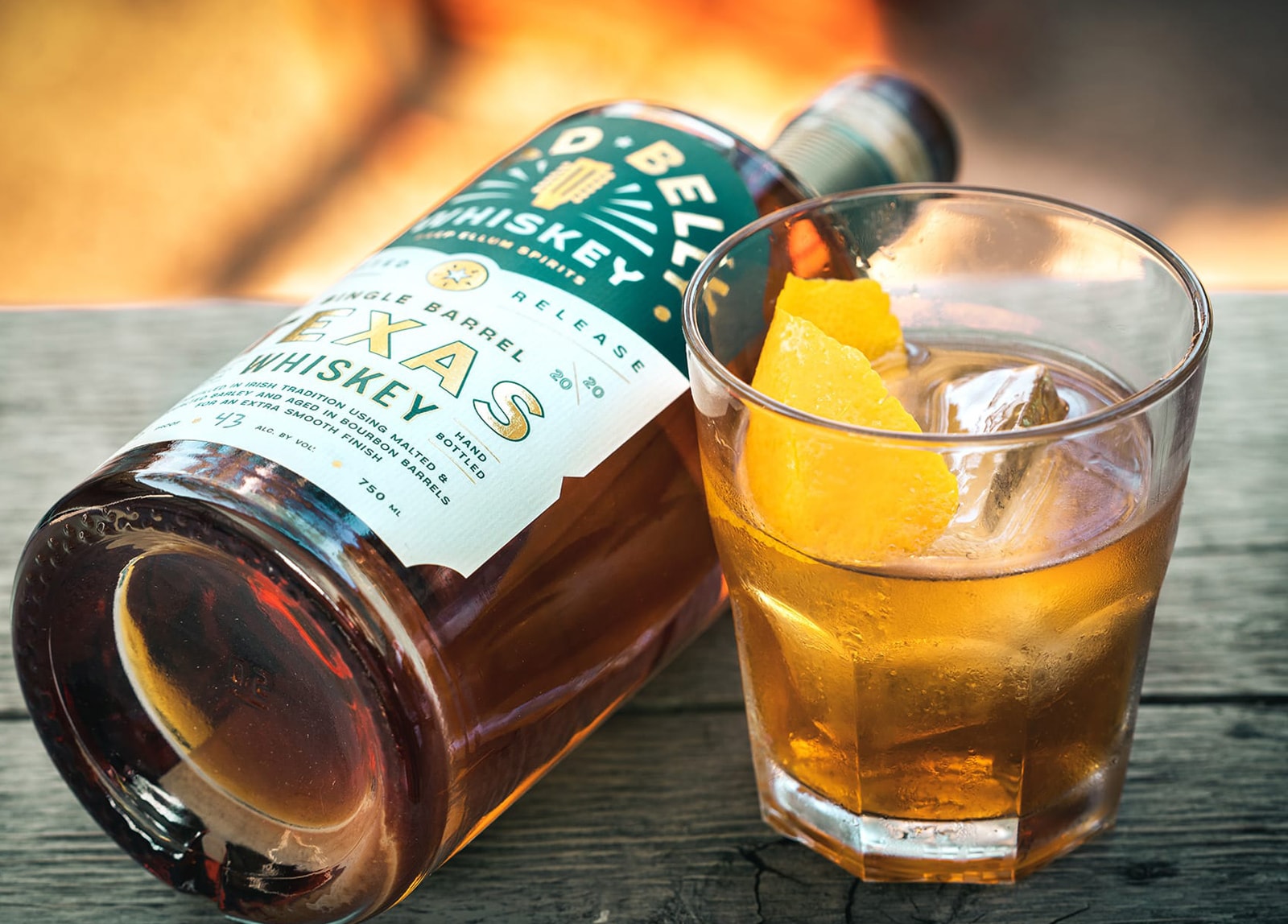
Lead Belly WhiskeyProject type
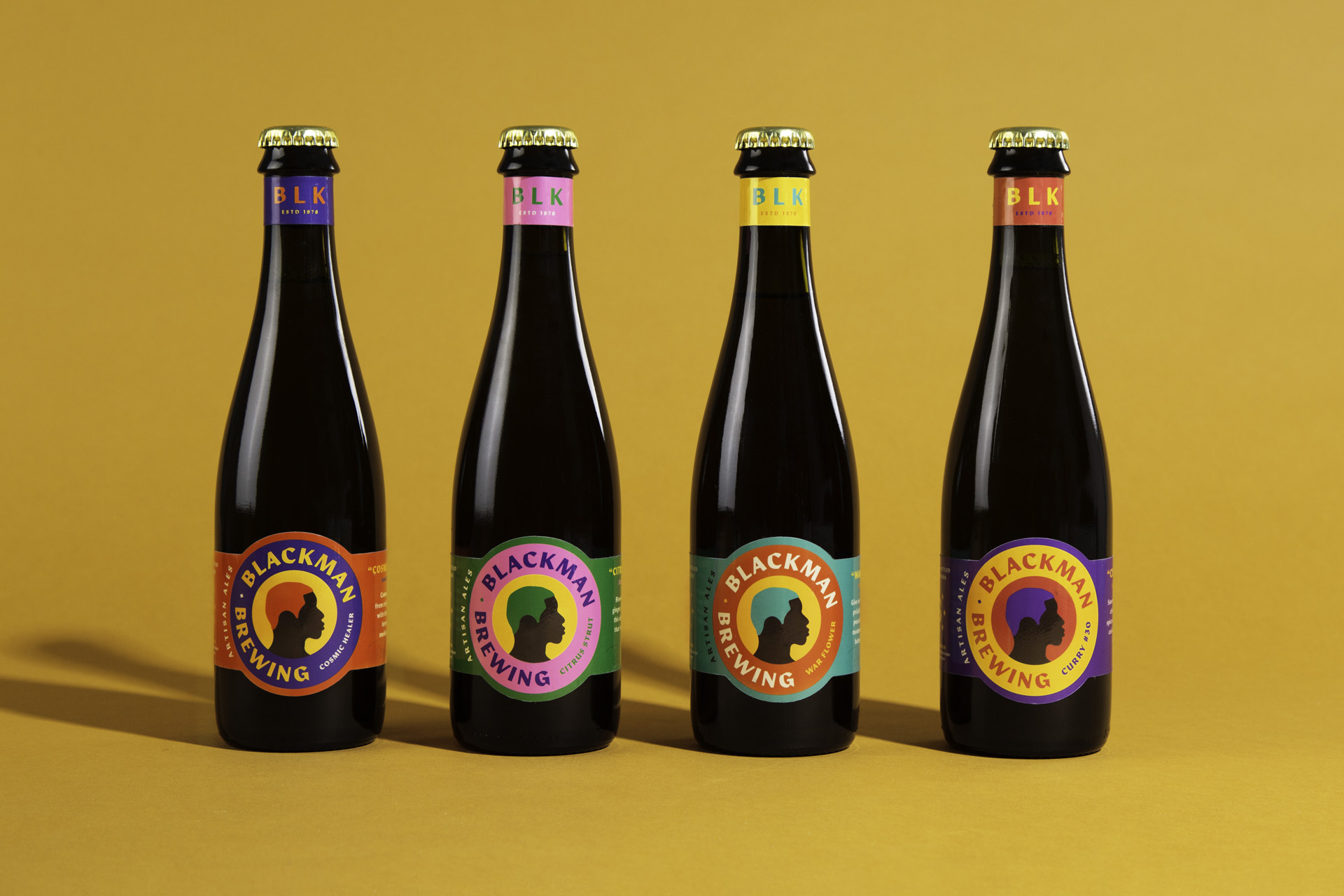
BlackMan BrewingBranding & Packaging
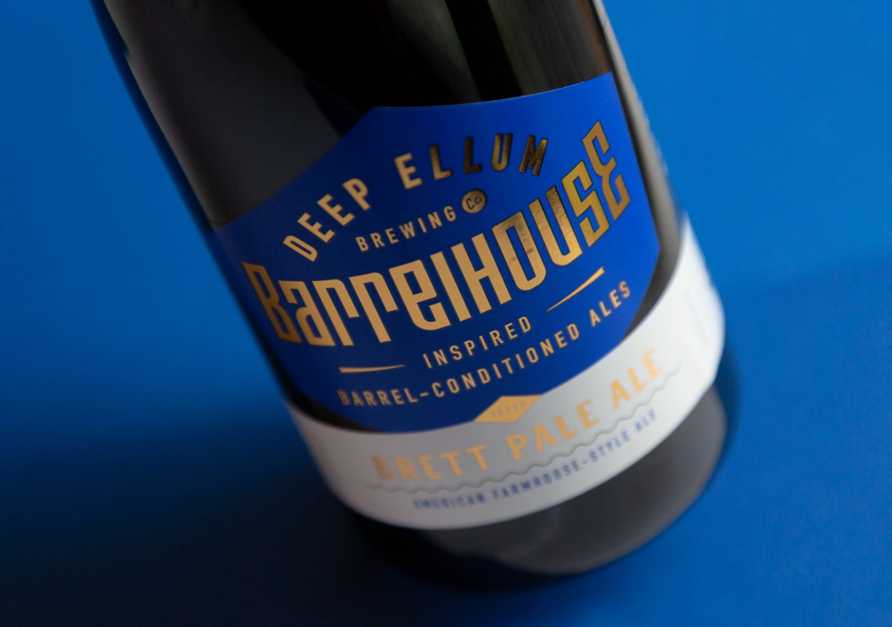
Deep Ellum BarrelhouseBranding & Packaging

