


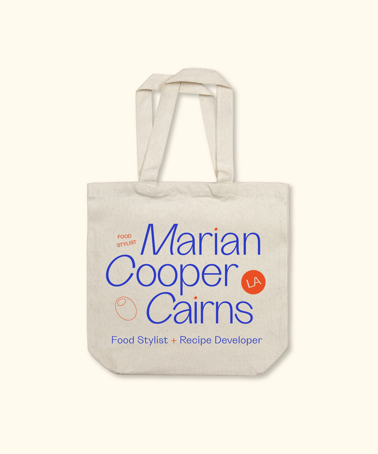
Marian Cooper Cairns
Brand Refresh
Creative Direction • Brand Design • Website Refresh
Opportunity
Marian Cooper Cairns is an established food stylist in Los Angeles who came to us for refresh of her visual identity and website. Her existing logo and website was tried and true, but needed an update to stay competitive. We saw an opportunity to focus on Marian's quirky personality and love for French maritime aesthetic while keeping it professional.
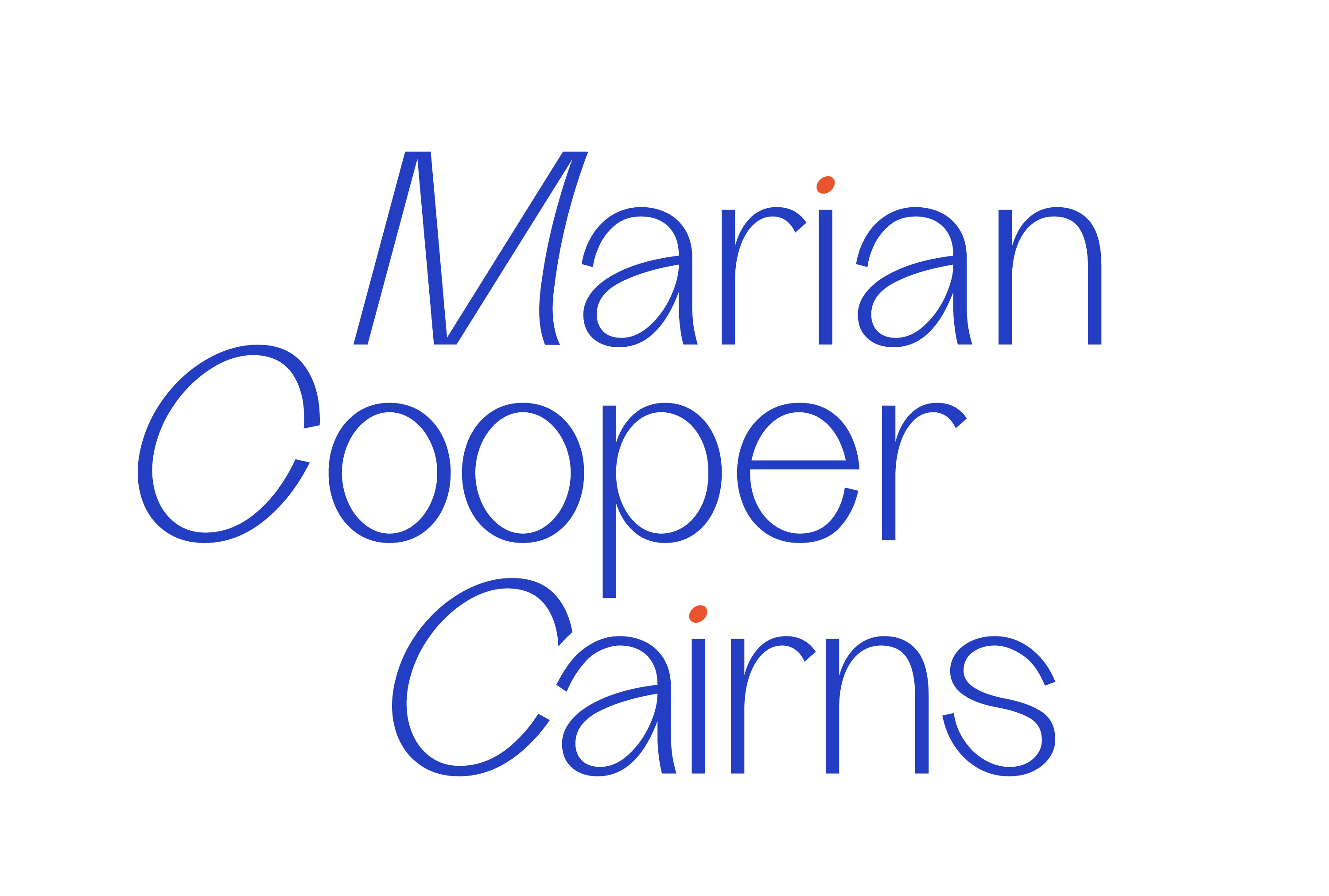
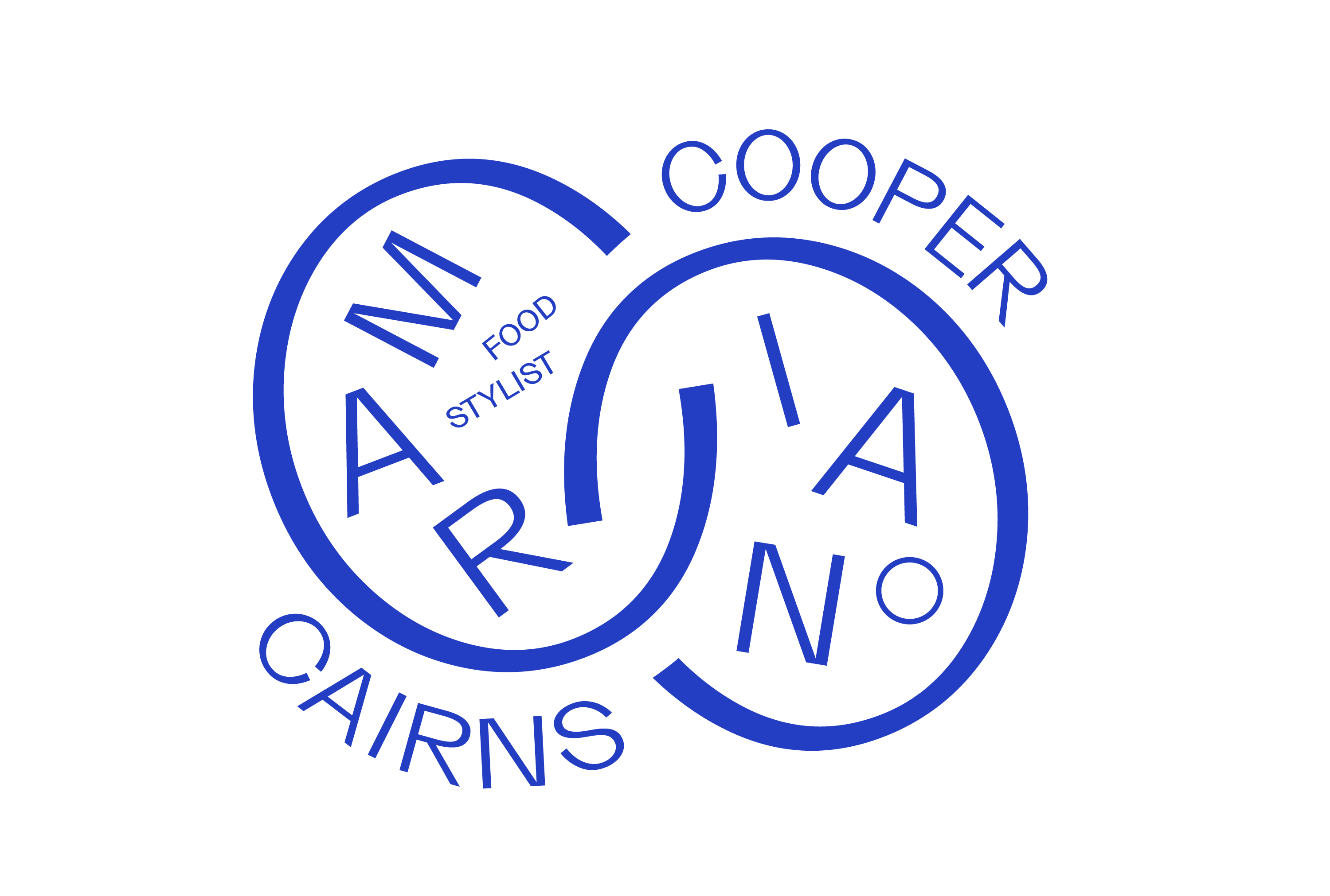
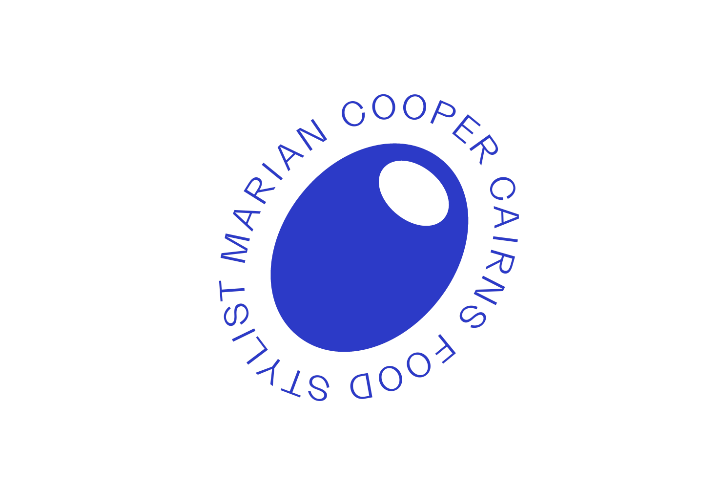
Identity Glow-up
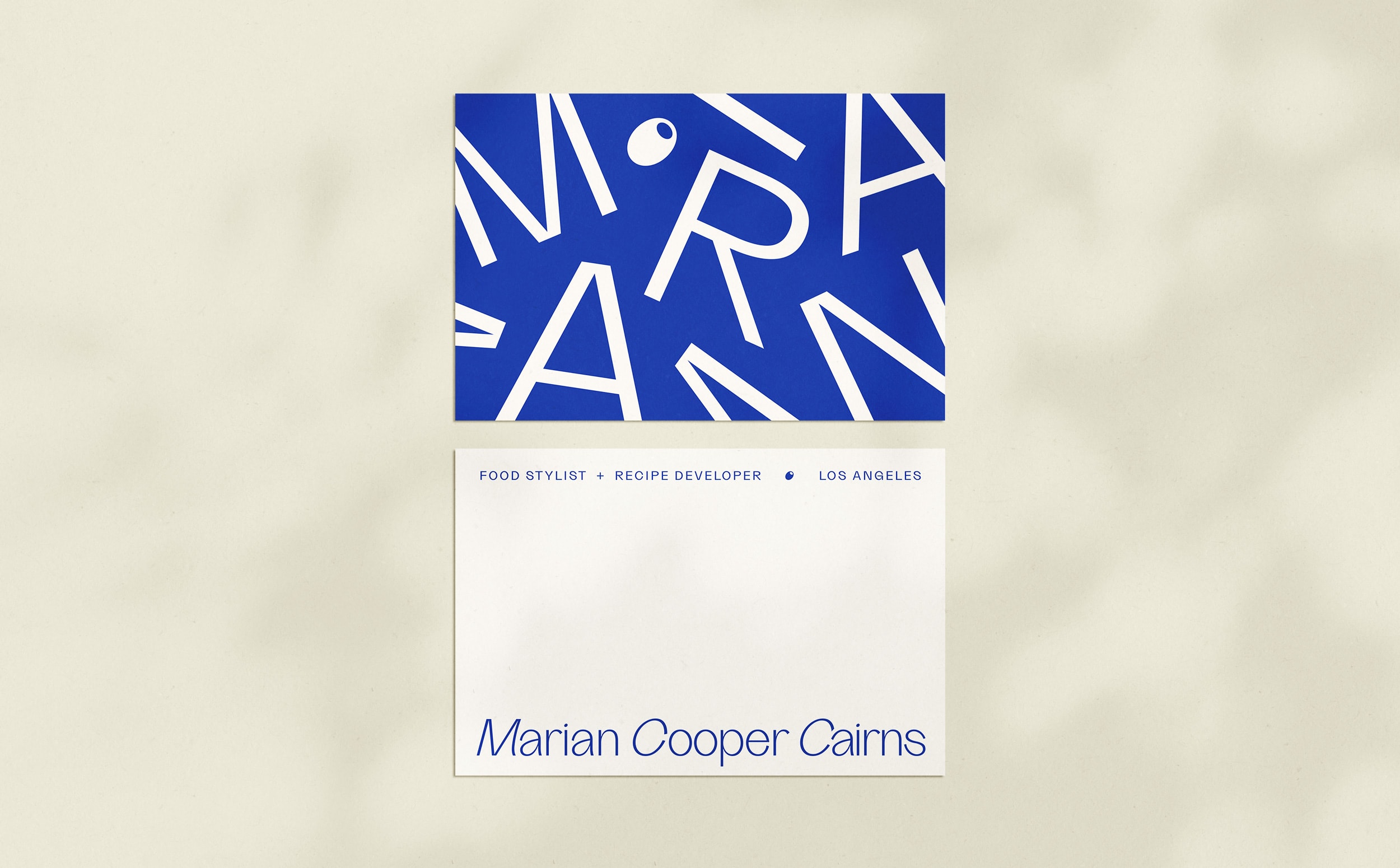
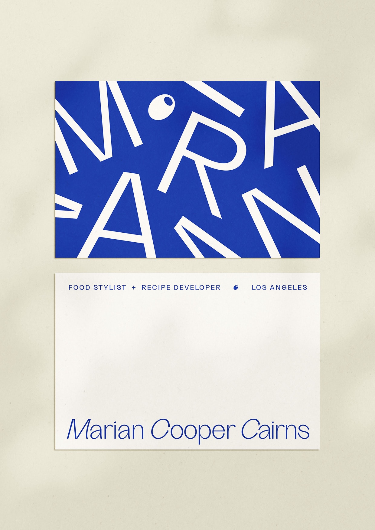
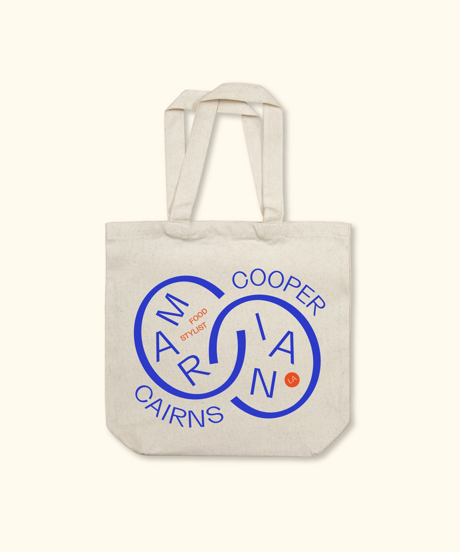
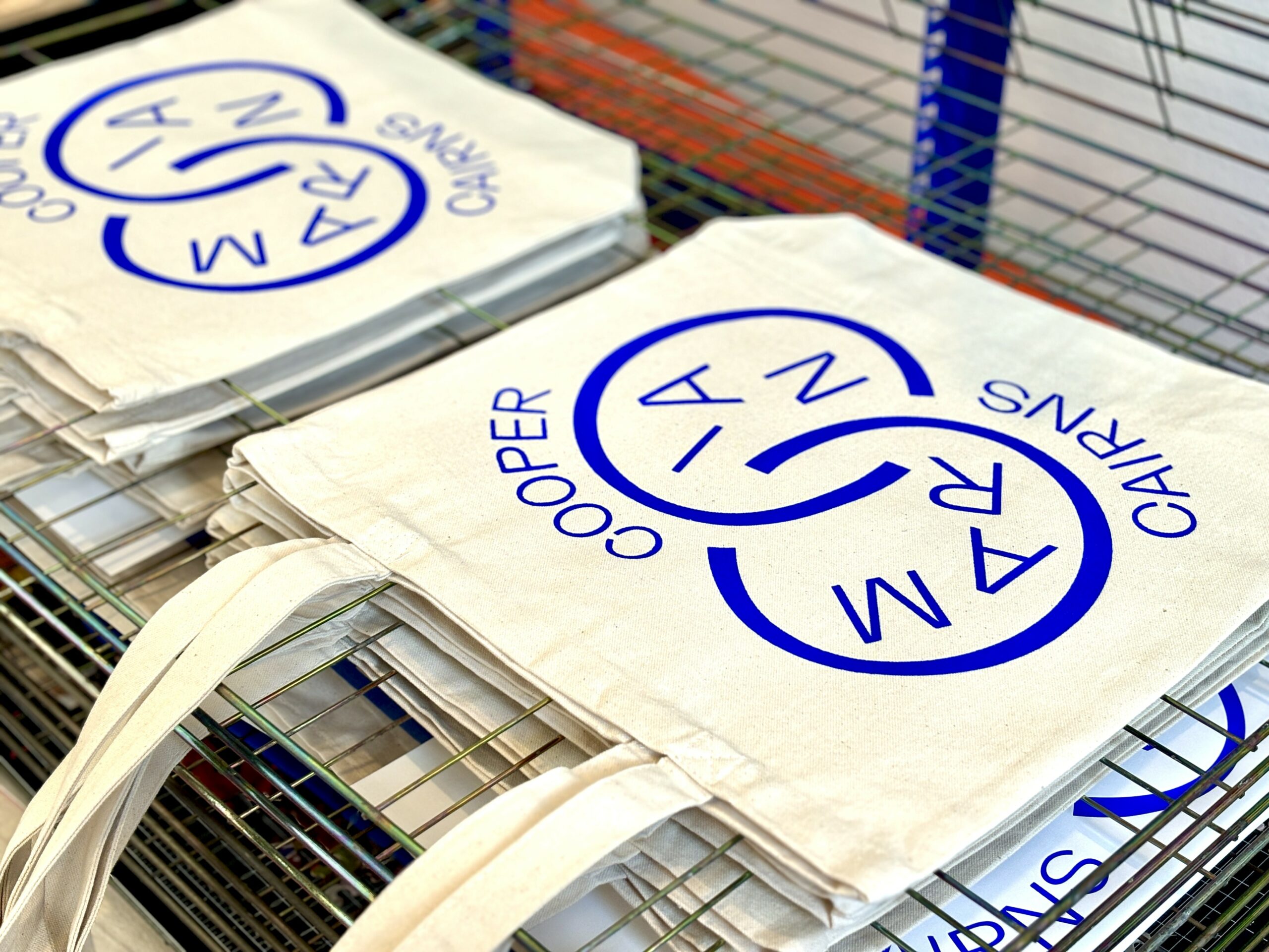
The resulting logotype is a customized version of Grotta by Type Department. We added purposeful interactions between letterforms as a nod to Marian's impeccable attention to detail in her work. Secondary lockups lean even further into her quirkiness with a fun shuffled lockup of her name and an olive icon that represents her love for food and style.
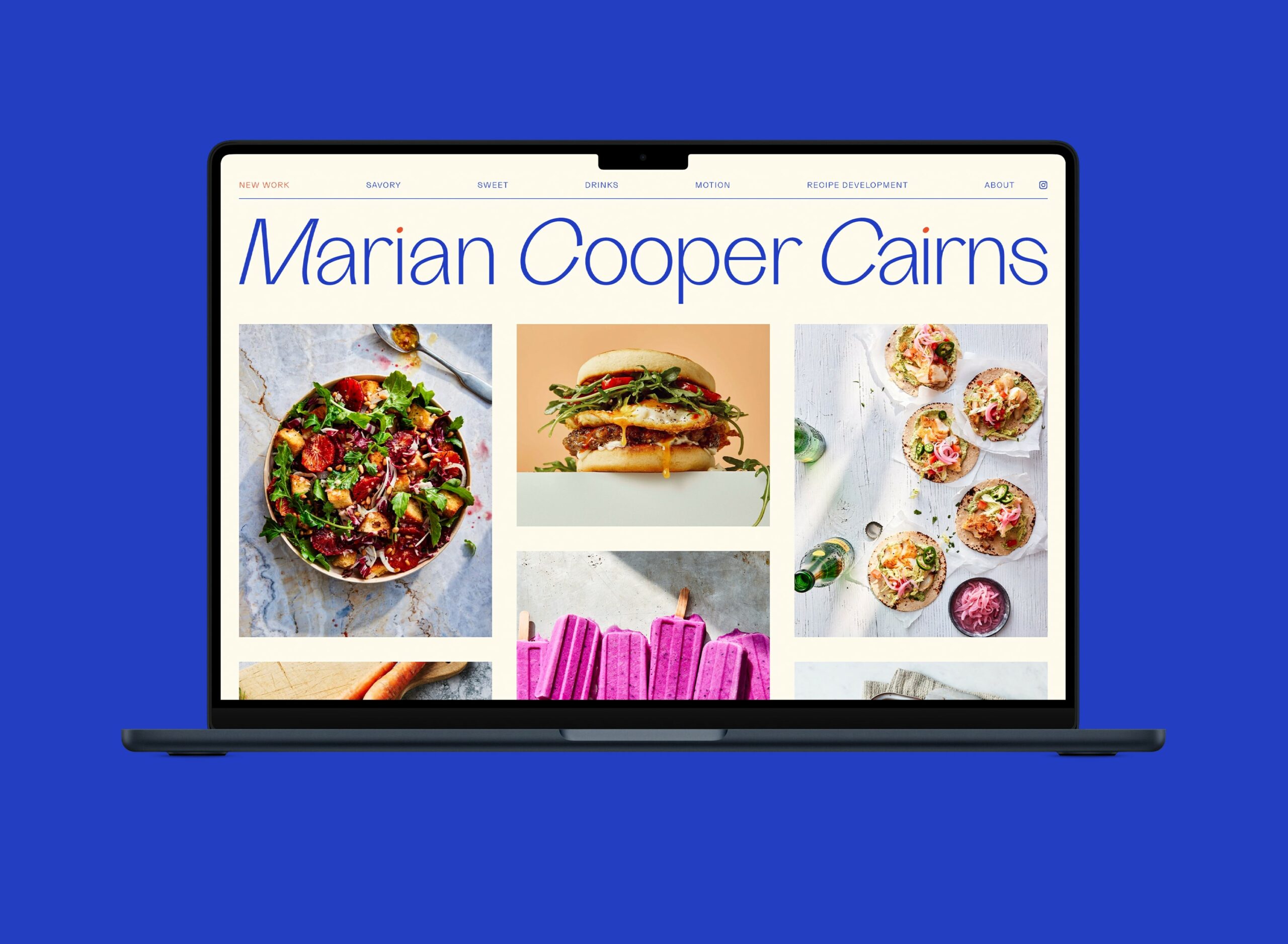
Website Refresh
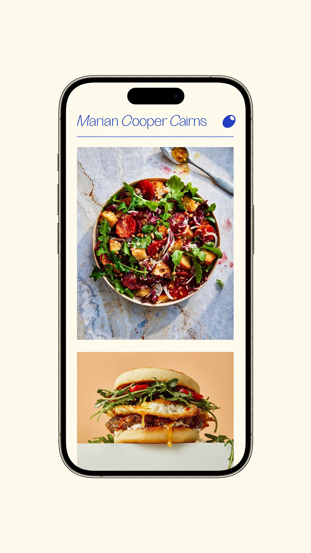
We rebuilt Marian's website from scratch to be more impactful and memorable. Her long name allows the logotype to become a commanding masthead spanning the full width of each page. Portfolio pages can get quiet long, allowing potential clients to quickly get a sense of the stylist's work, but make navigation tedious and frustrating. The new site's menu bar stays fixed at the top of the browser for easier navigation.
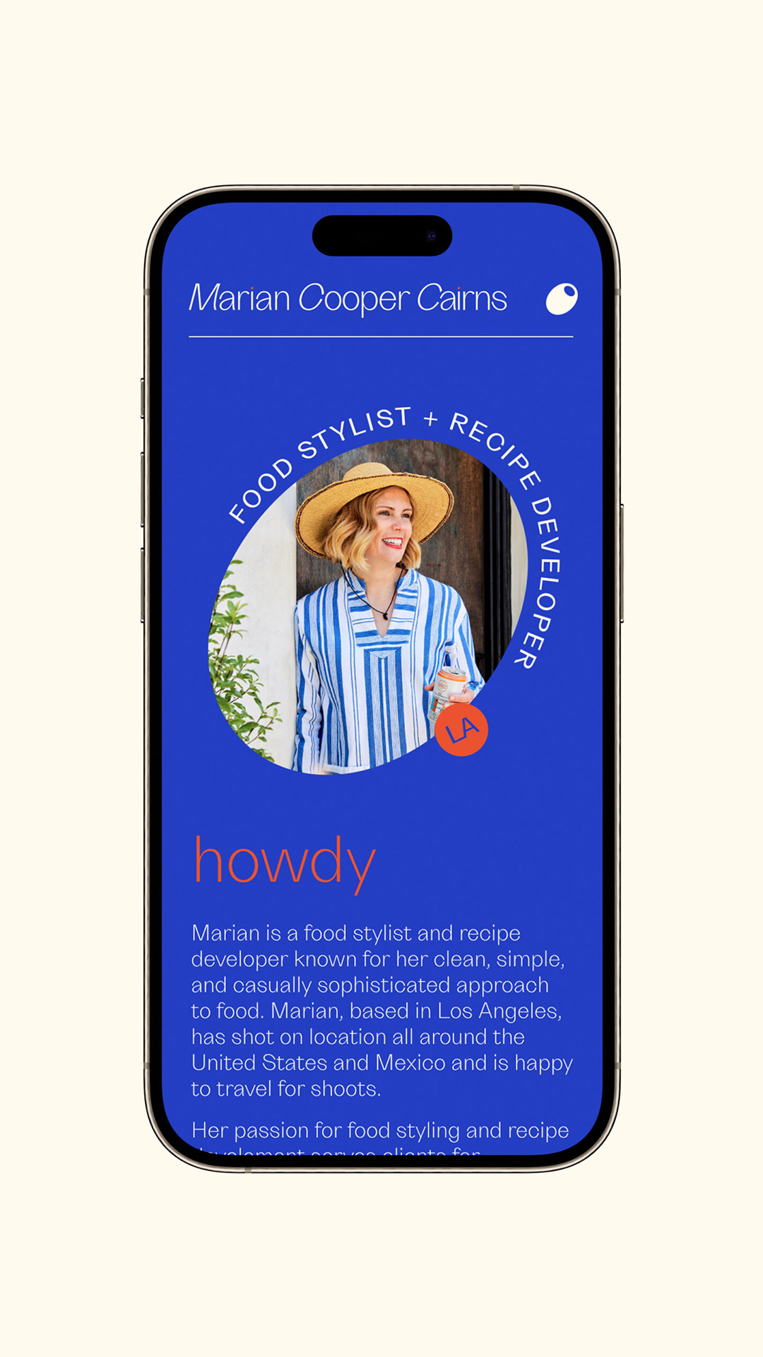
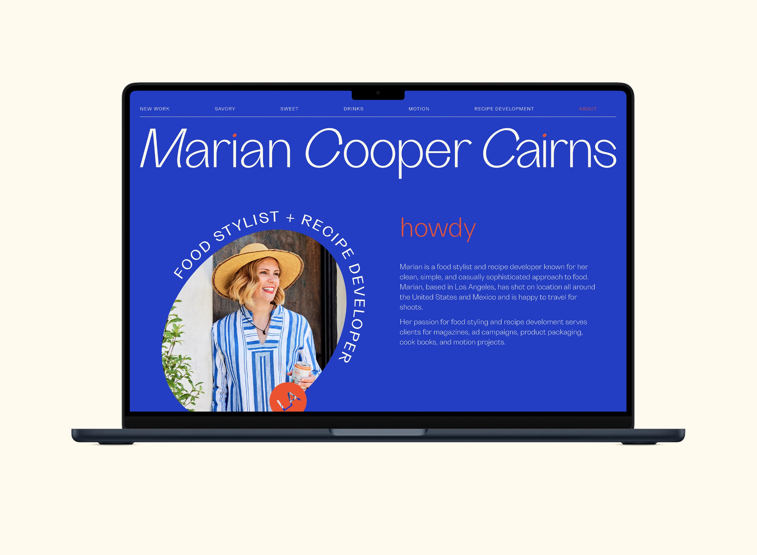
The about page can often be an after thought. We kept it simple but bold with a custom frame for her photo and a bold background that stands apart from the rest of the site. For the mobile menu, we brought in the olive instead of the generic hamburger as a touch of garnish.

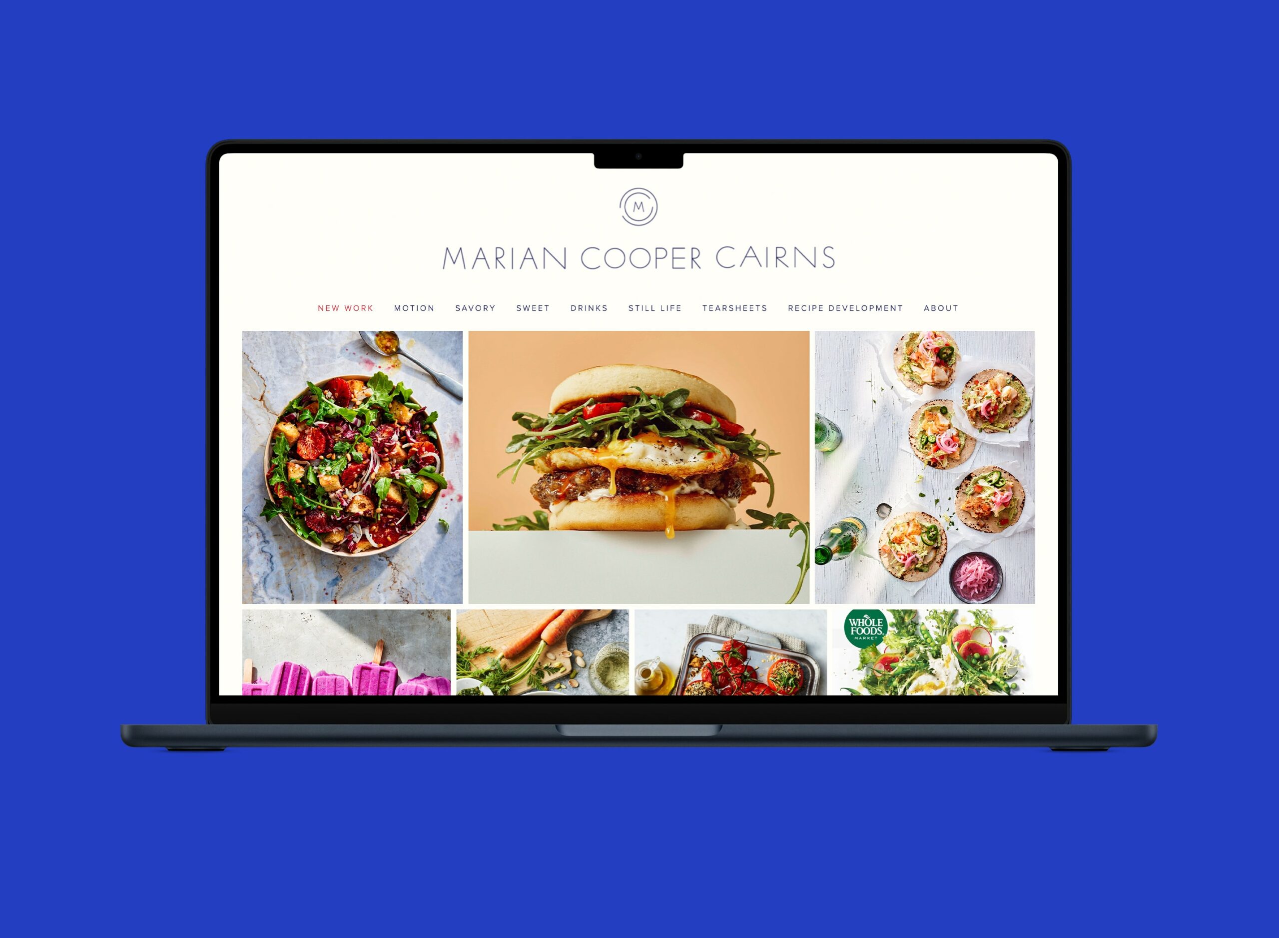
Website Before & After
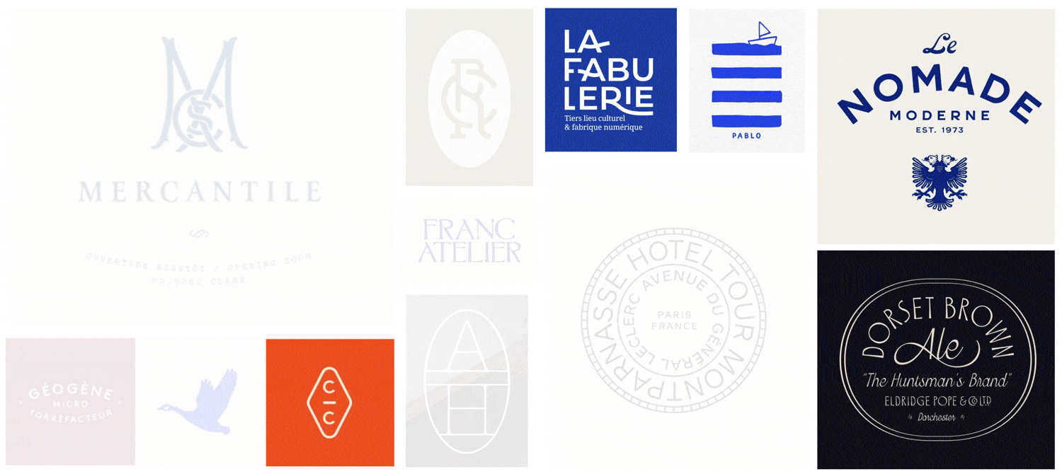
More Projects
La Colombe Coffee Roast PackagingBranding and Packaging
Deep Ellum IPA Brand RefreshBreathing new life to an iconic IPA brand without losing its recognition on the shelf.
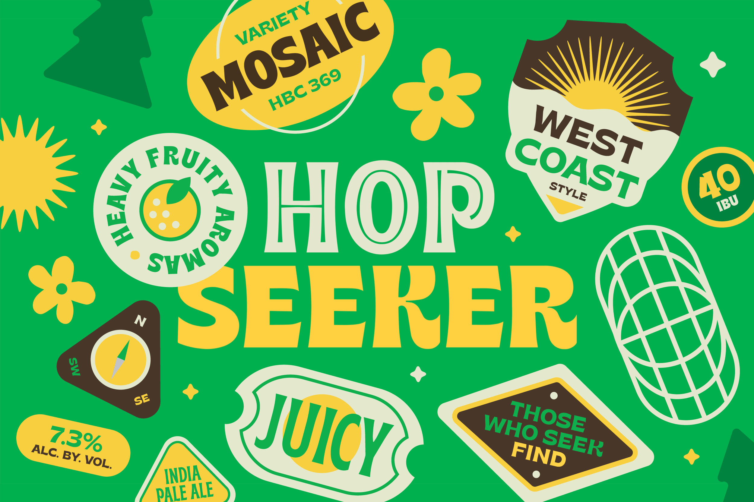
Hop Seeker IPA SeriesA fun and versatile world of characters and stickers for a rotating India Pale Ale series.
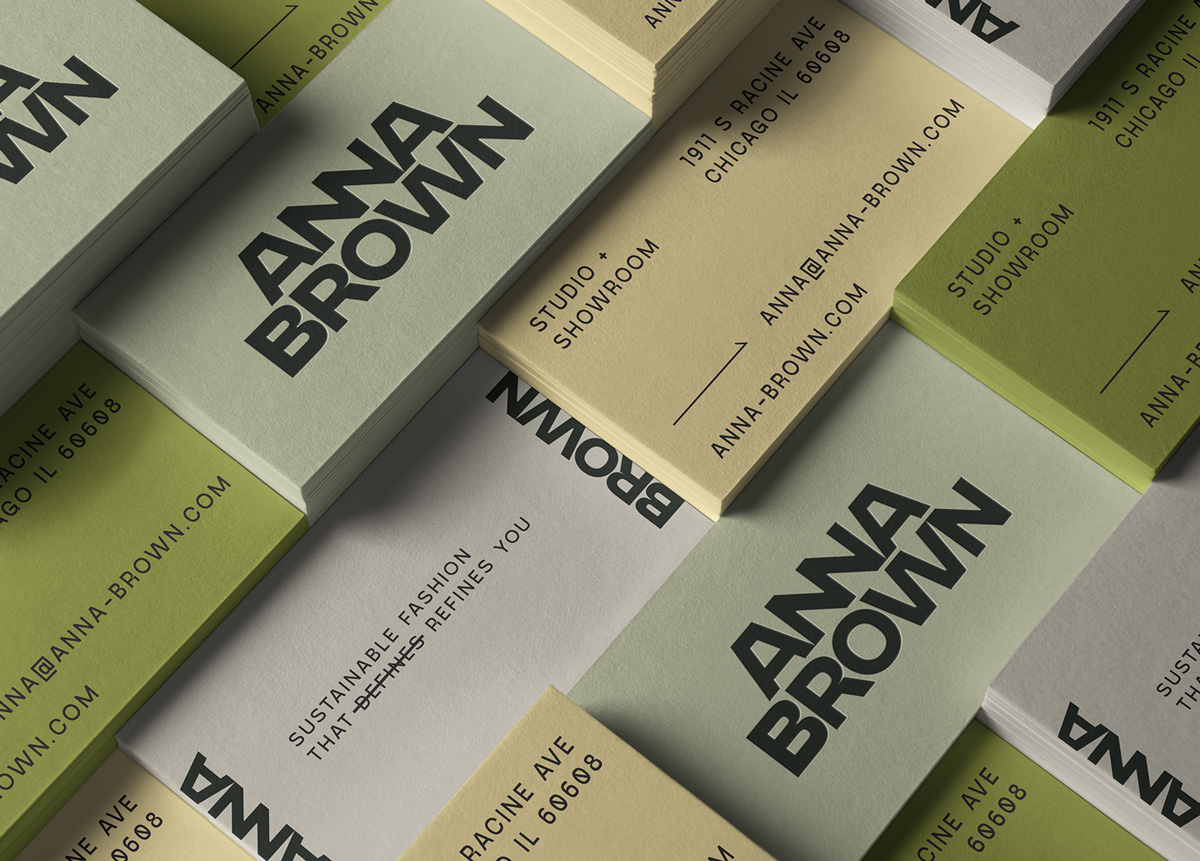
Anna Brown StudioProject type
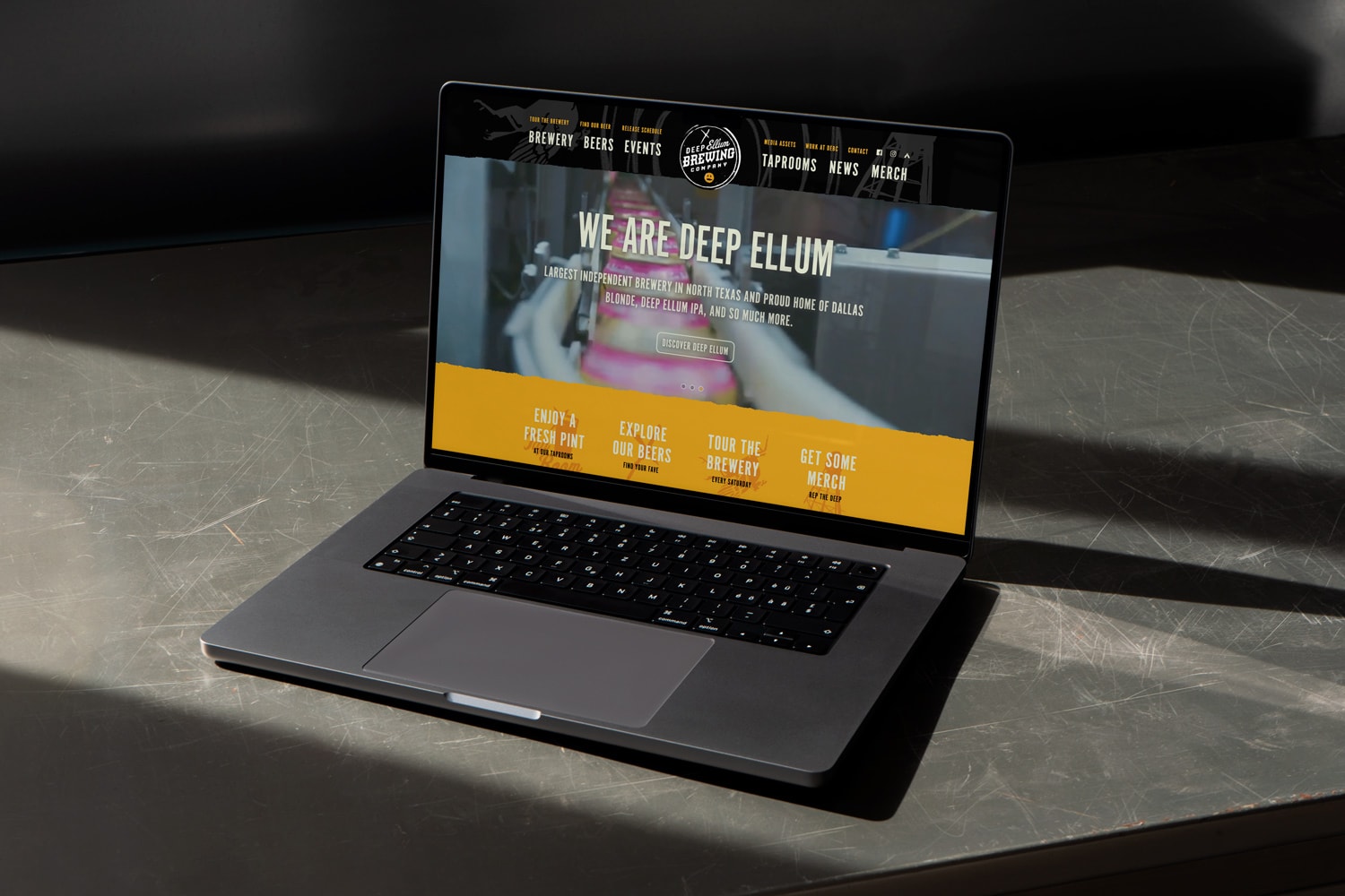
Deep Ellum Brewing Website RedesignProject type
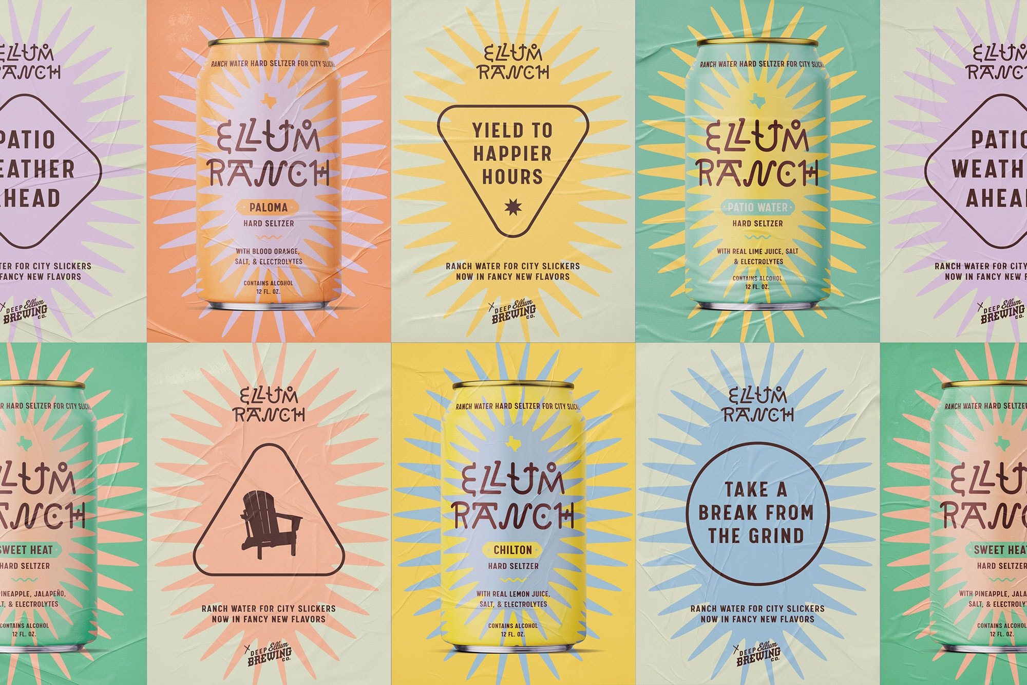
Ellum Ranch Patio WaterA ranch water hard seltzer that's proud of its city slicker roots.
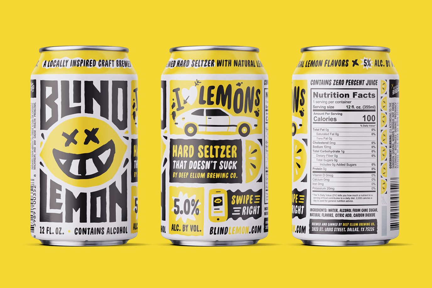
Blind Lemon Hard Seltzer NewProject type
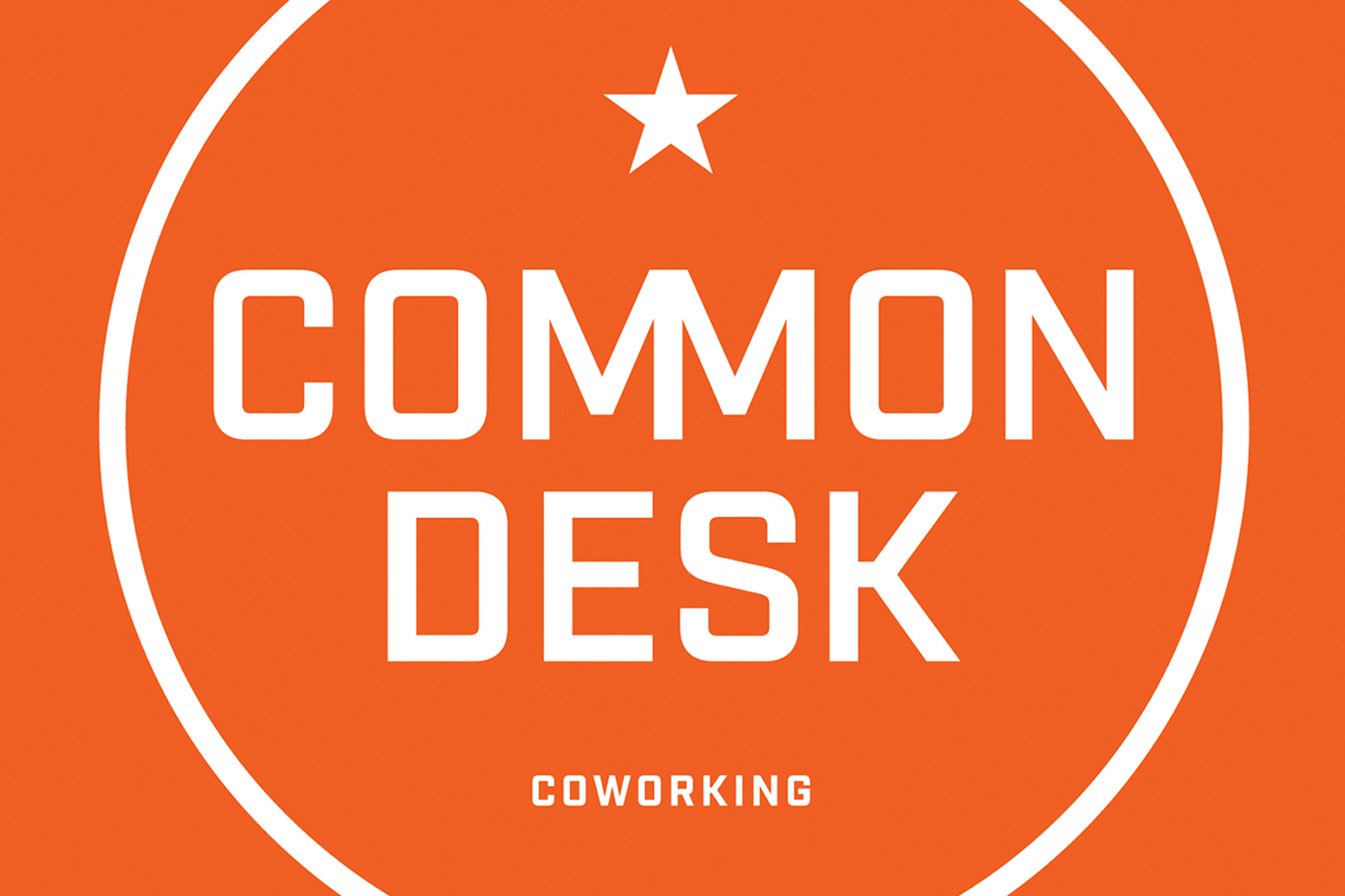
Common DeskProject type
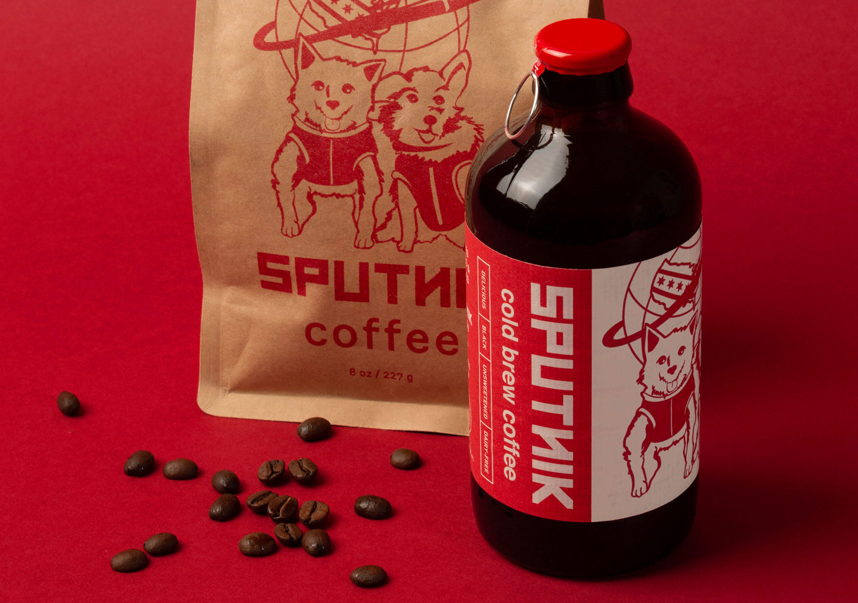
Sputnik Cold Brew CoffeeSputnik Cold Brew Bottle Label
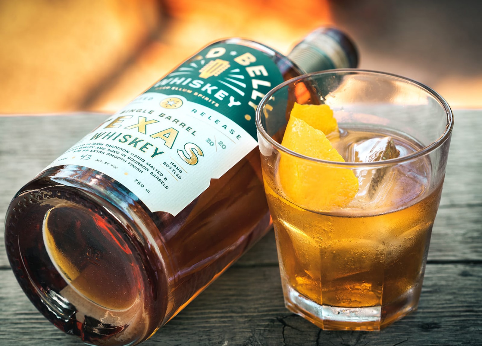
Lead Belly WhiskeyProject type
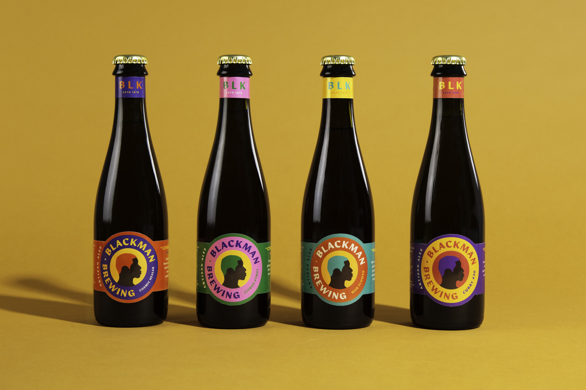
BlackMan BrewingBranding & Packaging
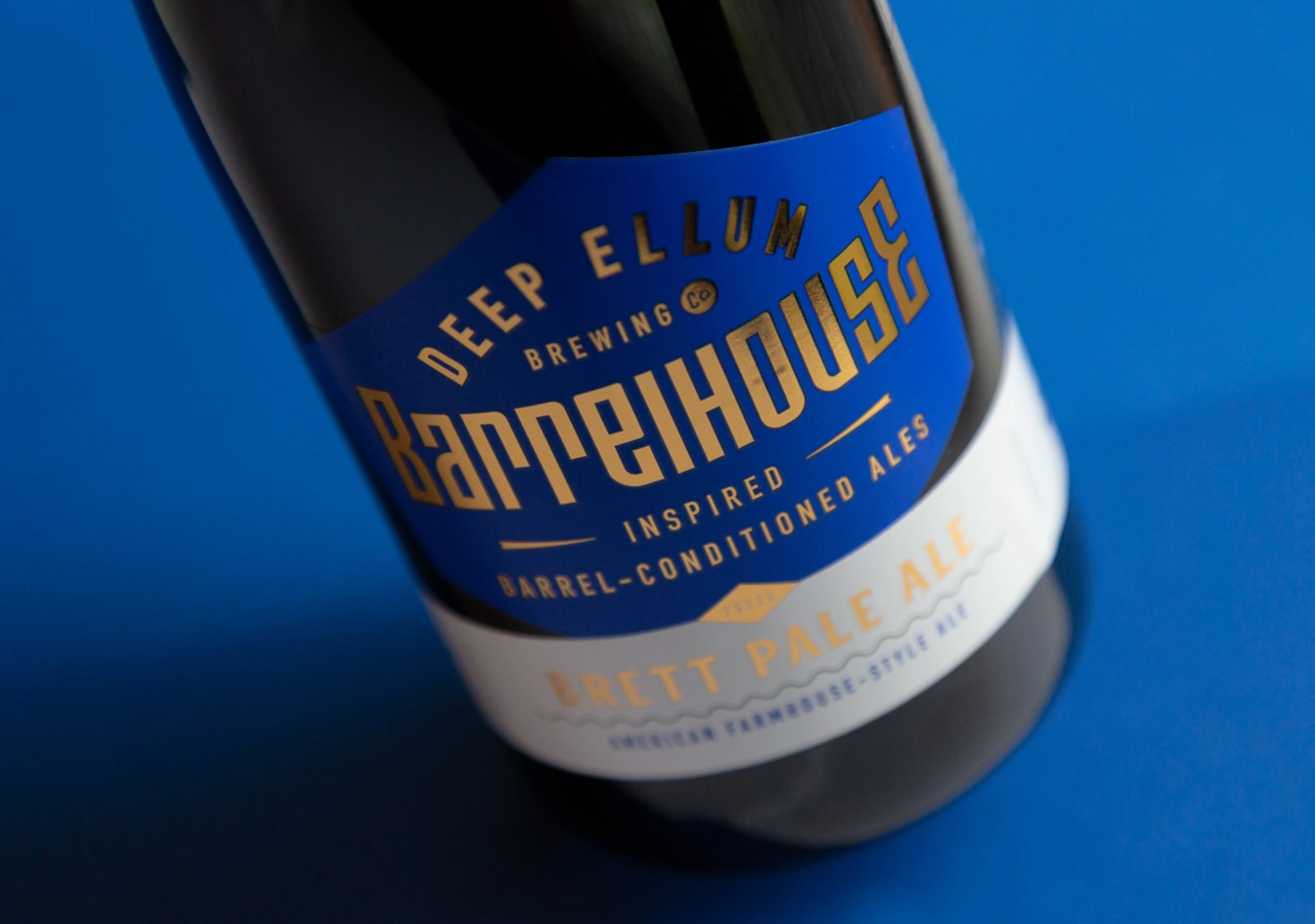
Deep Ellum BarrelhouseBranding & Packaging